The
AutoLisp Tutorial
Dialog Control Language -
Controls
Let's take a look at the
different controls you can put on the dialog box. You've seen a few of them in the
overview portion but let's go over the majority of them now. I will only show
the most used properties for each control.
LAYOUT CONTROLS:
: column {
label = "My Column";
} |
Column You can omit the label.
|
: boxed_column {
label = "My Column";
} |
Boxed Column You can omit the label.
|
: row {
label = "My Row";
} |
Row You can omit the label.
|
: boxed_row {
label = "My Row";
} |
Boxed Row You can omit the label.
|
: spacer {
width = 10;
height = 15;
} |
A normal spacer to help align other controls. You can omit
the width and height properties.
|
| : spacer_0;
|
A spacer that usually has no width. It simply means, if you
have to stretch something in this row to make things fit, stretch this spacer instead of
the other items.. |
| : spacer_1; |
The smallest spacer that's visually noticable. |
BUTTON
| : button {
key = "button1;
label = "Okay";
is_tab_stop = true;
is_cancel = false;
is_default = true;
width = 15;
height = 10;
mnemonic = "B";
}
|
key = The name you assign to the button. label = The text displayed on
the button.
is_cancel = Determines if this is the cancel button. One control must be assigned
to be the cancel action.
is_default = Determines if this button activates when the user presses the enter key.
mnemonic = Determines if you can press ALT+B to move to this action key. You
assign the letter and DCL will underscore the letter on the dialog box to let the user
know it is ALT-able. If that is a word! |
 |
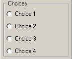
BOXED RADIO COLUMN, RADIO COLUMN, & RADIO BUTTON
: radio_column {
label = "Choices";
key = "choices"; |
// Use boxed_radio_column if a box is required.
// Label for the column or boxed_column
// Action key for the radio column |
 |
: radio_button {
label = "Choice 1";
key = "choice1";
} |
// First radio button |
: radio_button {
label = "Choice 2";
key = "choice2";
} |
// Second radio button |
: radio_button {
label = "Choice 3";
key = "choice3";
} |
// Third radio button |
: radio_button {
label = "Choice 4";
key = "choice4";
} |
// Fourth radio button |
| } |
// Close the radio_column |
BOXED RADIO ROW, RADIO ROW, & RADIO BUTTON
: radio_row {
label = "Choices";
key = "choices"; |
// Use boxed_radio_row for box.
// Label for the row or boxed_row
// Action key for the radio row |
 |
: radio_button {
label = "1";
key = "choice1";
} |
// First radio button |
: radio_button {
label = "2";
key = "choice2";
} |
// Second radio button |
: radio_button {
label = "3";
key = "choice3";
} |
// Third radio button |
: radio_button {
label = "4";
key = "choice4";
} |
// Fourth radio button |
| } |
// Close the radio_row |
EDIT BOX
: edit_box {
key = "myval";
label = "Value:";
edit_width = 10;
value = "";
} |
// Action key
// Label for the edit box
// Character width
// Initial value |
 |
LIST BOX
: list_box {
label ="Choose Items";
key = "mylist";
height = 15;
width = 25;
multiple_select = true;
fixed_width_font = true;
value = "0";
} |
// Label for the list box
// Action key
// Height of list box
// Width of list box
// Multiple Select = TRUE
// Use fixed with font = TRUE
// Initial selection = 1st item
|

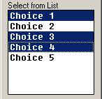
Fixed Width Font = TRUE
Multiple Select = TRUE |
|
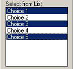
| View of list box with...

Fixed Width Font = FALSE.
Multiple Select = TRUE. |
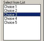
View of list box with...

Fixed Width Font = FALSE.
Multiple Select = FALSE. |
|
POPUP LIST
: popup_list {
key = "mylist";
label = "Select Item";
fixed_width_font = false;
width = 15;
value = 0;
} |
// Action key
// Label
// Use fixed with font = false
// Width of list box
// Initial selection = 1st item
|

 |
TEXT
: text {
key = "mytext";
value = "This is text!";
} |
// Action key
// Value |
 |
Okay. That's it for controls. There are others but, these are the
most used controls. Let's move on.
Back
AutoLisp Tutorial Home