
Contents


Index  Topic Contents
Previous Topic: Optimizing Active Channels over HTTP
Next Topic: Using Dynamic HTML with Active Channels
 | ||
| ||
| ||
Guidelines for Active Channel Logo Images
The guidelines listed in this section are provided to help Web publishers create useful and compelling logos that represent their channel content. When creating images, be aware that the logos are displayed with a fixed 256-color palette, regardless of the monitor's color depth. Therefore, using the Microsoft® Windows® halftone palette is recommended, if possible. The height (H) and width (W) of the images described in these guidelines are assumed to be in pixels.
Active Channel Logos
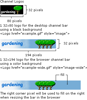
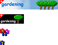
Microsoft Internet Explorer 4.0 uses different logo sizes for channels displayed on the desktop and channels displayed inside the browser window, as previously discussed. The desktop Channel Bar logo is 32H x 80W, and the Channels Explorer Bar logo is 32H x 194W. When a user resizes the width of the Channels Explorer Bar beyond 194 pixels, the remaining area on the right side of the 32H x 194W logo is filled in with the rightmost top pixel. If only the 32H x 80W image is provided, it is displayed in both places—on the desktop and inside the browser window. When displayed in the browser window Channels Explorer Bar, the remaining area on the right side of the logo is filled in with the same color as the leftmost top pixel. The 32H x 80W logo for the desktop must have a black background, while the logo for the browser should use a colored background. To specify the logos in the CDF file, the following format is used.
For the 32H x 80W logo:
<LOGO HREF="example.gif" STYLE="Image">For the 32H x 194W logo:
<LOGO HREF="example-wide.gif" STYLE="Image-Wide">For the 16H x 16W icon images:
<LOGO HREF="example-icon.gif" STYLE="Icon">
Desktop Channel Bar Logos
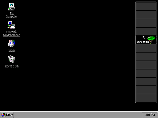
The desktop Channel Bar displays the smaller logo (32H x 80W) for each available channel. To match the visual elements used on the desktop, a black background is required for each logo. All logos in the desktop Channel Bar are shown at the same time. The following illustration shows the hot tracking behavior for when a user moves the mouse over a logo. As the cursor is placed on an image in the desktop Channel Bar, the border around the logo surfaces into a 3-D button, much like other toolbars within Internet Explorer 4.0. This behavior helps make the desktop Channel Bar look like a well-integrated part of the product.
Channels Explorer Bar Logos
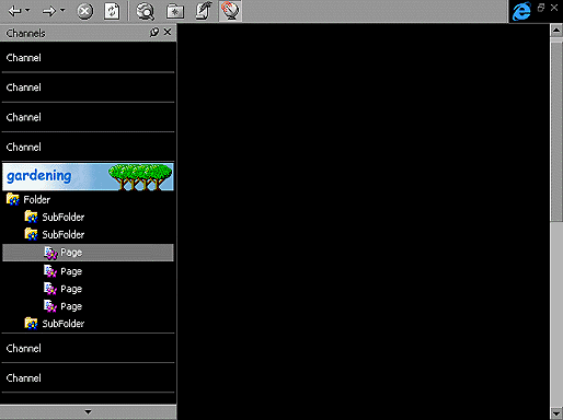
Inside the Browser window, Internet Explorer 4.0 uses the full-width logo (32H x 194W) in the Channels Explorer Bar. By default, only the channel name is displayed in white text on a black background for each channel. However, when the user moves the mouse over an item, it will hot-track to show the logo for that item. Using a color background for the large logo is recommended. If a user clicks a channel to activate it, that logo remains visible. This allows users to easily determine the current channel because they aren't distracted with logos from other channels.
Icons with Visual Clues
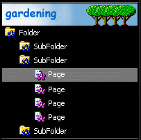
When designing your icons, use different images, colors, or shapes to indicate whether an item is a container for other subitems or is actual content. This will help the user discover your channel's content.
Update Gleams
The channel bar provides the user with a 14H x 14W "gleam" to indicate when content has been updated. This gleam is a triangular overlay applied to the upper-left corner of a channel logo. When authoring images for any size, it's important not to place critical text or visual elements in this area, because it will be covered when the gleam is visible. Gleams are also overlaid on any 16H x 16W icon in the channel's hierarchy when that page has been updated. The gleam placed on icons is 7H x 7W.
Guideline Summary for Active Channel Images
Use the following guidelines when authoring Active Channel images:
- Logos for the desktop must use a predominately black background. The appearance of the channel bar needs to blend into the Active Desktop, which uses a black background. This reduces visual clutter for the user and helps the logos visually tie in to the desktop Channel Bar user interface.
- When creating the large logo, do not bleed an image on the right. If the user resizes the Channels Explorer Bar, the image will be cropped and the space to the right of the logo will be filled with the upper-right corner pixel color. Design your large logo with this in mind.
- Provide consistent elements in both large logo sizes. When creating these logos, try to include a visual tie-in so users can recognize the channel in the transition from desktop to browser. When users click your desktop logo, they should be able to easily recognize its larger counterpart inside the browser.
- Provide consistent elements in icons for pages and folders. Icons for pages and folders should tie in visually with their logo. Try to avoid creating too many icons, because it may be difficult for users to recognize all of them.
- Be aware of the location of the update gleam. Avoid putting critical text or visual elements in the upper-left corner, because this area will be covered by the gleam for channel updates.
Top of Page
© 1997 Microsoft Corporation. All rights reserved. Terms of Use.