Digitizing a design
This section describes the coordinate system used to establish the locations of the points that define a glyph outline. It also documents the placement of glyphs with respect to the coordinate axes.
Outlines
In a TrueType font, glyph shapes are described by their outlines. A glyph outline consists of a series of contours. A simple glyph may have only one contour. More complex glyphs can have two or more contours. Composite glyphs can be constructed by combining two or more simpler glyphs. Certain control characters that have no visible manifestation will map to the glyph with no contours.
Figure 1-1 Glyphs with one, two, three contours respectively


Contours are composed of straight lines and curves. Curves are defined by a series of points that describe second order Bezier-splines. The TrueType Bezier-spline format uses two types of points to define curves, those that are on the curve and those that are off the curve. Any combination of off and on curve points is acceptable when defining a curve. Straight lines are defined by two consecutive on curve points.
Figure 1-2 A glyph description consisting of a series of on and off curve points
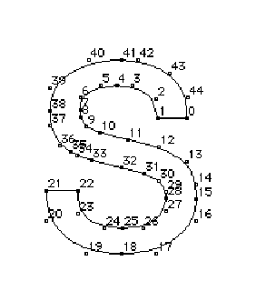
The points that make up a curve must be numbered in consecutive order. It makes a difference whether the order is increasing or decreasing in determining the fill pattern of the shapes that make up the glyph. The direction of the curves has to be such that, if the curve is followed in the direction of increasing point numbers, the black space (the filled area) will always be to the right.
FUnits and the em square
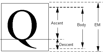
In a TrueType font file point locations are described in font units, or FUnits. An FUnit is the smallest measurable unit in the em square, an imaginary square that is used to size and align glyphs. The dimensions of the em square typically are those of the full body height of a font plus some extra spacing to prevent lines of text from colliding when typeset without extra leading.
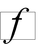
While in the days of metal type, glyphs could not extend beyond the em square, digital typefaces are not so constrained. The em square may be made large enough to completely contain all glyphs, including accented glyphs. Or, if it proves convenient, portions of glyphs may extend outside the em square. TrueType fonts can handle either approach so the choice is that of the font manufacturer.
Figure 1-3 A character that extends outside of the em square
The em square defines a two-dimensional coordinate grid whose x-axis describes movement in a horizontal direction and whose y-axis describes movement in a vertical direction. This is discussed in more detail in the following section.
FUnits and the grid
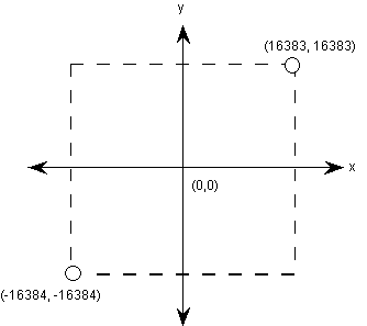
A key decision in digitizing a font is determining the resolution at which the points that make up glyph outlines will be described. The points represent locations in a grid whose smallest addressable unit is known as an FUnit or font Unit. The grid is a two-dimensional coordinate system whose x-axis describes movement in a horizontal direction and whose y-axis describes movement in a vertical direction. The grid origin has the coordinates (0,0). The grid is not an infinite plane. Each point must be within the range -16384 and +16383 FUnits. Depending upon the resolution chosen, the range of addressable grid locations will be smaller.
The choice of the granularity of the coordinate grid—that is, number of units per em (upem)—is made by the font manufacturer. Outline scaling will be fastest if units per em is chosen to be a power of 2, such as 2048.
Figure 1-4 The coordinate system
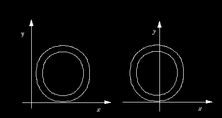
The origin of the em square need not have any consistent relationship to the glyph outlines. In practice, however, applications depend upon the existence of some convention for the placement of glyphs for a given font. For Roman fonts, which are intended to be laid out horizontally, a y-coordinate value of 0 typically is assumed to correspond to the baseline of the font. No particular meaning is assigned to an x-coordinate of 0 but manufacturers may improve the performance of applications by choosing a standard meaning for the x-origin.
For example, you might place a glyph so that its aesthetic center is at the x-coordinate value of 0. That is, a set of glyphs so designed when placed in a column such that their x-coordinate values of 0 are coincident will appear to be nicely centered. This option would be used for Kanji or any fonts that are typeset vertically. Another alternative is to place each glyph so that its leftmost extreme outline point has an x-value equal to the left-side-bearing of the glyph. Fonts created in this way may allow some applications to print more quickly to PostScript printers.
Figure 1-5 Two possible choices for the glyph origin in a Roman font. In the first case (left) the left side bearing is x-zero. In the second (right), the aesthetic center of the character is x-zero
Non-Roman fonts may wish to use other conventions for the meaning of the x-origin and y-origin. For best results with high-lighting and carets, the body of the character should be roughly centered within the advance width. For example, a symmetrical character would have equal left and right side bearings.
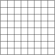
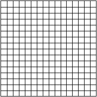
The granularity of the em square is determined by the number of FUnits per em, or more simply units per em . The em square as divided into FUnits defines a coordinate system with one unit equaling an FUnit. All points defined in this coordinate system must have integral locations. The greater the number of units per em, the greater the precision available in addressing locations within the em square.
Figure 1-6 Two em squares, 8 units per em (left), 16 units per em (right)
FUnits are relative units because they vary in size as the size of the em square changes. The number of units per em remains constant for a given font regardless of the point size. The number of points per em, however, will vary with the point size of a glyph. An em square is exactly 9 points high when a glyph is displayed at 9 points, exactly 10 points high when the font is displayed at 10 point, and so on. Since the number of units per em does not vary with the point size at which the font is displayed, the absolute size of an FUnit varies as the point size varies.
Figure 1-7 72 point M and 127 point M and their em squares. Upem equals 8 in both cases.
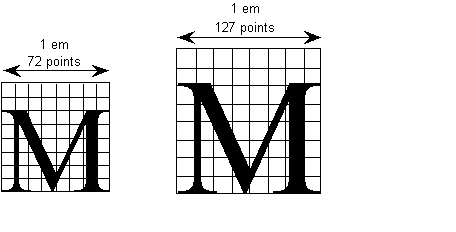
Because FUnits are relative to the em square, a given location on a glyph will have the same coordinate location in FUnits regardless of the point size at which the font is rendered. This is convenient because it makes it possible to instruct outline points once considering only the original outline and have the changes apply to the glyph at whatever size and resolution it is ultimately rendered.