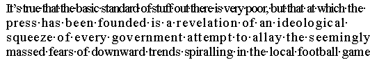
Figure 6a. Poorly justified text
To offset these effects, text-processing clients have used justification algorithms that redistribute the space with a series of glyph spacing adjustments that progress from least to most obvious. Typically, the client will begin by expanding or compressing the space between words. If these changes aren't enough or look distracting, the client might hyphenate the word at the end of the line or adjust the space between glyphs in one or more lines. To disguise spacing inconsistencies so they won't disrupt the flow of text for a reader, the font developer can use the JSTF table to enable or disable individual glyph substitution and positioning actions that apply to specific scripts, language systems, and glyphs in the font. For instance, a ligature glyph can replace multiple glyphs, shortening the line of text with an unobtrusive, localized adjustment (see Figure 6b). Font-specific positioning changes can be applied to particular glyphs in a text line that combines two or more fonts. Other options include repositioning the individual glyphs in the line, expanding the space between specific pairs of glyphs, and decreasing the spacing within particular glyph sequences.