Nancy Winnick Cluts
Microsoft Developer Network Technology Group
Created: March 28, 1994
The next release of the Microsoft® Windows® operating system (called Windows 95) presents a new set of common controls to developers of Windows-based applications. These controls are provided in a new dynamic-link library (DLL) called COMCTL32.DLL. The controls allow developers to integrate existing applications into the new Windows 95 shell more thoroughly and seamlessly. COMCTL32.DLL is included with Windows 95 and will be supported in the future in Win32s™ (running on Windows version 3.1) and in Windows NT™. Note that these new controls are 32-bit only—they will not be supported in 16-bit Windows environments.
This article explains the fundamentals of Win32® common controls. It is the first in a series of articles describing the new common controls. The other articles in the series cover the following topics:
Parts 2–6 of the series have associated code samples that demonstrate the use of the Win32 common controls.
Please note that this article is based on preliminary information that is subject to change before the final version of Windows 95.
The Win32® common controls are windows that are supported by the COMCTL32.DLL dynamic-link library (DLL). COMCTL32.DLL is included with the next version of the Microsoft® Windows® operating system (called Windows 95) and will also be supported in Win32s™ (running on Windows version 3.1) and in Windows NT™. The new controls are 32-bit only—they will not be supported in 16-bit Windows environments.
COMCTL32.DLL contains the window procedure and the functions that support common controls. Before you make any calls into this library, you should ensure that it has been loaded. You can ensure that COMCTL32.DLL has been loaded by calling the Windows InitCommonControls function. InitCommonControls is a stub function that takes no parameters and returns no values.
Common controls are child windows that send notification messages to their parent windows when events (such as input from the user) occur in the control. Because these controls are windows, they can be manipulated through the standard window management functions. Some common controls send notifications as WM_COMMAND messages, while others send WM_NOTIFY messages. Each common control supports a set of control messages that an application can use to manipulate the control. Some common controls have a set of macros that an application can use instead of the send or post functions. These macros are generally easier to use than the standard functions or the standard messages.
Before we discuss the new styles and notifications that come with the new controls, let's take a look at each new control.
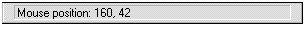
A status bar is a special area within a window that displays information. It reflects the current state of the object that is being viewed in the window, or provides other relevant information about the object or operations that can be performed on the object. You can see an example of a status bar at the bottom of the screen in the File Manager (see Figure 1). In this example, the status bar displays the current mouse position.
Figure 1. Status bar
A toolbar is a frame that contains a set of controls. Toolbars allow users to perform common tasks with a simple click of the button rather than having to remember some obscure key combination or menu command. Toolbars can be used in ribbons, tool boxes, and palettes. See the File Manager or Microsoft Word for Windows version 6.0 for examples of toolbars.
Many developers design their own toolbars for their applications. For example, Figure 2 shows the Word for Windows 6.0 toolbar, which was not created with the new common control library. Adding ToolTips to a toolbar (those cool little text boxes that pop up when you point to a toolbar button with the mouse) can really make the toolbar a handy item to have in your application.

Figure 2. Toolbar
The new up-down control provides a pair of arrows to increment and decrement the value in an adjacent (buddy) control. The up-down control makes it easy for you to add the functionality of spin boxes to your application. This control comes in handy whenever you want to give the user a list of selections. You generally use up-down controls to increment and decrement numeric values, but the values do not have to be numeric. (For example, you can use an up-down control to flip through the months of the year.) The up-down control is generally used in combination with an edit control, but this is not a requirement either. (Frankly, I cannot think of any other control you would want to pair the up-down control with—if you can think of one, let me know.) Figure 3 shows a spin box, which consists of an up-down control paired with an edit control.
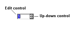
Figure 3. Spin box
A progress indicator shows the percentage of completion of a particular process. This control is useful whenever you have a task that takes a lengthy amount of time. Progress indicators are often utilized in setup and installation programs; the progress indicator shows how far the installation has progressed.

Figure 4. Progress indicator
The trackbar control allows the user to alter the intensity level (such as brightness or volume) of a computer function in an intuitive way. A trackbar looks like a volume control on a stereo. It consists of a bar that defines the range of the adjustment and a slider that indicates the current value for the control. The slider also adjusts the value. The user can move the slider by dragging it with the mouse or by using the arrow keys. An example of a trackbar can be found in the Volume Control accessory, which uses the trackbar control to adjust the volume going from your sound card to your speakers.
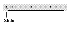
Figure 5. Trackbar
Header windows, also known as column headings, are generally used in conjunction with the new list view windows. Figure 6 shows the header windows that the Windows 95 shell uses to display the contents of your computer. Clicking a heading re-sorts the data according to that heading. For example, clicking the Type heading sorts the data by data type.

Figure 6. Header window
A list view is a specialized window that displays a set of items. This window allows you to display items (such as files) in four ways: using their large (or standard) icons, using their small icons, as a list, or as a report.
Figure 7 shows a list view window in standard icon view—each item is represented by a standard icon and a text label.
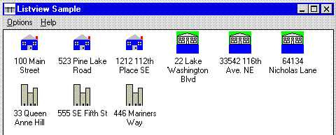
Figure 7. List view window in icon view
If you want to save some screen real estate, you can switch to small icon view, as illustrated in Figure 8. Notice that the labels appear truncated. To avoid truncation, you can reset the length of the displayed text in your program.
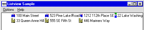
Figure 8. List view window in small icon view
You can look at the same items in list view. This view uses the small icon and the text label to display the objects in a single-column list on the screen.
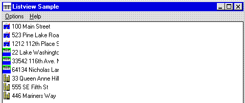
Figure 9. List view window in list view
The final view that you can use with a list view window is the report view, illustrated in Figure 10. This view displays the objects with their small icons and labels, and allows you to display additional information in adjacent columns. If the user clicks one of the column headings, the list is sorted based on the sort criterion specified for that column. For instance, clicking the Bedrooms heading sorts the data by the number of bedrooms.
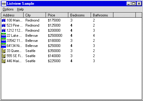
Figure 10. List view window in report view
A tree view window is a special list window that displays a set of items as a tree hierarchy. The tree provides an indented outline with plus and minus icons, which expand and collapse the outline. The tree view window is typically used to display a directory or to represent the relationships among a set of containers. You can see an example of the tree view window in Windows 95 when you Explore a directory. The tree view window in Figure 11 displays the fictional houses for sale in different cities in the Seattle area.
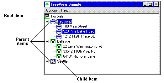
Figure 11. Tree view window
A tab control is generally used to switch between property sheets containing information that the user can view and/or set. The Windows 95 shell makes extensive use of tabs in the Control Panel. For example, the Control Panel Display applet provides tabbed property sheets to display settings for Background, Screen Saver, Appearance, and Settings. Tab controls allow the user to switch between these categories. Previous versions of Windows used individual dialog boxes to display each set of display attributes. In Windows 95, all of the attributes are in one dialog box, and the user clicks the tab controls to switch from one set to the next.
In Figure 12, tabs are used to switch between property sheets for Font, Alignment, and Number options used in formatting cells.
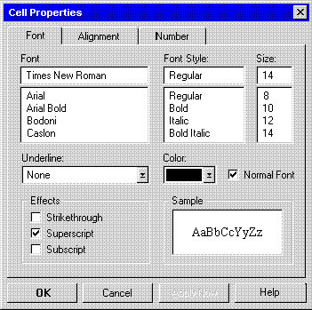
Figure 12. Tab controls in a property sheet
Each type of common control described in the previous section belongs to a window class that is defined by the common control library. An application creates a common control of a particular type by specifying the appropriate window class name either in the CreateWindow or CreateWindowEx function or in a dialog box template. The following table lists the window classes provided by the common control library.
Table 1. Common Control Window Classes
| Class Name | Description |
| HOTKEY_CLASS | Allows the developer to define hot keys. |
| PROGRESS_CLASS | Provides a method for indicating the progress of a lengthy operation. |
| STATUSCLASSNAME | Provides a method for displaying status information. |
| TOOLBARCLASSNAME | Provides buttons that carry out menu commands. |
| TOOLTIPS_CLASS | Creates a ToolTips control. This control displays a small pop-up window containing a textual hint that explains the purpose of a tool in an application. ToolTips are generally used in conjunction with toolbars. |
| TRACKBARCLASS | Allows the user to select from a range of values by moving a slider. |
| UPDOWN_CLASS | Provides a pair of arrows to increment or decrement the value in an adjacent (buddy) control. For example, you can create a spin box by combining an up-down control with an edit control. |
| WC_HEADER | Provides a method for displaying headings above columns of information, and allows the user to sort the information by clicking the headings. |
| WC_LISTVIEW | Provides a method for displaying a collection of items. Each item consists of an icon and a label. WC_LISTVIEW also provides several methods for arranging the items. |
| WC_TABCONTROL | Provides a method for defining multiple pages for the same area of a window or dialog box. Each page consists of a set of information or a group of controls that the application displays when the user selects the corresponding tab. |
| WC_TREEVIEW | Provides a method for displaying a hierarchical list of items. Each item consists of a label and an optional bitmap. |
The Win32 application programming interface (API) offers several new styles that you can use when creating the new common controls. These styles are listed and described in the table below. You can generally combine these styles when you create the new controls. In the table below, I have noted the cases where styles cannot be used in combination.
Table 2. Common Control Styles
| Style | Description |
| CCS_ADJUSTABLE | Allows a toolbar to be configured by the user. |
| CCS_BOTTOM | Positions the control at the bottom of its parent window's client area, and sets the control width to the parent window width. Status bars have this style by default. |
| CCS_NODIVIDER | Prevents a 2-pixel highlight from being drawn at the top of the control. |
| CCS_NOHILITE | Prevents a 1-pixel highlight from being drawn at the top of the control. |
| CCS_NOMOVEY | Causes the control to resize and move itself horizontally, but not vertically, in response to a WM_SIZE message. This style is ignored if the CCS_NORESIZE style is set. Header windows have the CCS_NOMOVE style by default. |
| CCS_NOPARENTALIGN | Prevents the control from automatically moving to the top or bottom of the parent window. A control with this style will maintain its position within the parent window even if the size of the parent window changes. If you specify the CCS_TOP or CCS_BOTTOM style with CCS_NOPARENTALIGN, the height of the control is adjusted to the default, and the position and width of the control remain unchanged. |
| CCS_NORESIZE | Prevents the control from using the default width and height when setting its initial size or a new size. The control with this style uses the width and height specified in the creation or sizing request. |
| CCS_TOP | Causes the control to position itself at the top of the parent window client area, and sets the control width to the parent window width. Toolbars have this style by default. |
A common control notifies its parent window of input events by sending notifications. Some common controls send notifications in the form of WM_NOTIFY messages. The lParam parameter of the WM_NOTIFY message is either the address of a NMHDR structure (a structure containing information about a notification message) or the address of a larger structure that includes the NMHDR structure. The NMHDR structure contains the following items:
Each common control has its own specific set of notification values. The common control library also provides notification values that can be sent by more than one type of common control. The following table lists the common control notifications.
Table 3. Common Control Notifications
| Notification Value | Description |
| NM_CLICK | The user clicked the left mouse button within the control. |
| NM_DBLCLK | The user double-clicked the left mouse button within the control. |
| NM_KILLFOCUS | The control lost the input focus. |
| NM_RCLICK | The user clicked the right mouse button within the control. |
| NM_RDBLCLK | The user double-clicked the right mouse button within the control. |
| NM_RETURN | The control has the input focus, and the user pressed the enter key. |
| NM_SETFOCUS | The control gained the input focus. |
The purpose of this article was to introduce you to the new common control library in Windows 95. I included illustrations of the new controls to give you an idea of the purpose and use of each control. If you wish to start implementing these controls in your own applications, be sure to read the rest of the articles in the "Win32 Common Controls" series. Parts 2 through 6 of the series will describe each common control in more detail and will provide you with the structures, messages, and notifications associated with each control. I have also included samples to get you started implementing the new controls. So, if you're ready to start working on status bars or toolbars, follow the yellow brick road to Part 2 (and pay no attention to that man behind the curtain).