
The check box control displays a check mark when it is selected. It is commonly used to present a Yes/No or True/False selection to the user. You can use check box controls in groups to display multiple choices from which the user can select one or more.
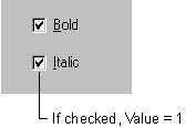
Figure 7.5 The check box control
The check box control is similar to the option button control in that each is used to indicate a selection that is made by the user. They differ in that only one option button in a group can be selected at a time. With the check box control, however, any number of check boxes may be selected.
For More Information See "Selecting Individual Options with Check Boxes" in "Forms, Controls, and Menus" for a simple demonstration of the check box control.
The Value property of the check box control indicates whether the check box is checked, unchecked, or unavailable (dimmed). When selected, the value is set to 1. For example:
The following table lists the values and equivalent Visual Basic constants that are used to set the Value property.
| Setting | Value | Constant |
| Unchecked | 0 | vbUnchecked |
| Checked | 1 | vbChecked |
| Unavailable | 2 | vbGrayed |
The user clicks the check box control to indicate a checked or unchecked state. You can then test for the state of the control and program your application to perform some action based on this information.
By default, the check box control is set to vbUnchecked. If you want to preselect several check boxes in a series of check boxes, you can do so by setting the Value property to vbChecked in the Form_Load or Form_Initialize procedures.
You can also set the Value property to vbGrayed to disable the check box. For example, you may want to disable a check box until a certain condition is met.
Whenever the user clicks on the check box control, the Click event is triggered. You can then program your application to perform some action depending upon the state of the check box. In the following example, the check box control's Caption property changes each time the control is clicked, indicating a checked or unchecked state.
Private Sub Check1_Click()
   If Check1.Value = vbChecked Then
      Check1.Caption = "Checked"
   ElseIf Check1.Value = vbUnchecked Then
      Check1.Caption = "Unchecked"
   End If
End Sub
Note If the user attempts to double-click the check box control, each click will be processed separately; that is, the check box control does not support the double-click event.
The Click event of the check box control is also triggered when the focus is shifted to the control with the keyboard by using the TAB key and then by pressing the SPACEBAR.
You can toggle selection of the check box control by adding an ampersand character before a letter in the Caption property to create a keyboard shortcut. For example:

In this example, pressing the ALT+C key combination toggles between the checked and unchecked states.
The check box control, like the command button and option button controls, may be visually enhanced by altering the setting of the Style property and then using the Picture, DownPicture, and DisabledPicture properties. For example, you may want to add an icon or bitmap to a check box or display a different image when the control is clicked or disabled.