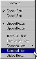
Menu items are the individual choices that appear in a menu. Menu items can be text, graphics such as icons or graphics and text combinations that represent the actions presented in the menu. The format for a menu item provides the user with visual cues about the nature of the effect it represents, as shown in Figure 7.5.
Figure 7.5 Formats for different menu items
Whenever a menu contains a set of related menu items, you can separate those sets with a grouping line known as a separator. The standard separator is a single line that spans the width of the menu. Avoid using menu items themselves as group separators, as shown in Figure 7.6.
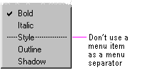
Figure 7.6 Inappropriate separator
Always provide the user with a visual indication about which menu items can be applied. If a menu item is not appropriate or applicable in a particular context, then disable or remove it. Leaving the menu item enabled and presenting a message box when the user selects the menu item is a poor method for providing feedback.
In general, it is better to disable a menu item rather than remove it because this provides more stability in the interface. However, if the context is such that the menu item is no longer or never relevant, remove it. For example, if a menu displays a set of open files and one of those files is closed or deleted, it is appropriate to remove the corresponding menu item.
If all items in a menu are disabled, disable its menu title. If you disable a menu item or its title, it does not prevent the user from browsing or choosing it. If you provide status bar messages, you can display a message indicating that the command is unavailable and why.
The system provides a standard appearance for displaying disabled menu items. If you are supplying your own visuals for a disabled menu item, follow the visual design guidelines for how to display it with an unavailable appearance.
Note 
For more information about displaying commands with an unavailable appearance, see Chapter 13, "Visual Design."
Many menu items take effect as soon as they are chosen. If the menu item is a command that requires additional information to complete its execution, follow the command with an ellipsis (...). The ellipsis informs the user that information is incomplete. When used with a command, it indicates that the user needs to provide more information to complete that command. Such commands usually result in the display of a dialog box. For example, the Save As command includes an ellipsis because the command is not complete until the user supplies or confirms a filename.
Not every command that produces a dialog box or other secondary window should include an ellipsis. For example, do not include an ellipsis with the Properties command because carrying out the Properties command displays a properties window. After completing the command, no further parameters or actions are required to fulfill the intent of the command. Similarly, do not include an ellipsis for a command that may result in the display of a message box.
While you can use menu items to carry out commands, you can also use menu items to switch a mode or set a state or property, rather than initiating a process. For example, choosing an item from a menu that contains a list of tools or views implies changing to that state. If the menu item represents a property value, when the user chooses the menu item, the property setting changes.
Menu items for state settings can be independent or interdependent:
When using the menu to represent the two states of a setting, if those states are obvious opposites, such as the presence or absence of a property value, you can use a check mark to indicate when the setting applies. For example, when reflecting the state of a text selection with a menu item labeled Bold, show a check mark next to the menu item when the text selection is bold and no check mark when it is not. If a selection contains mixed values for the same stat reflected in the menu, you also display the menu without the check mark.
However, if the two states of the setting are not obvious opposites, use a pair of alternating menu item names to indicate the two states. For example, a naive user might guess that the opposite of a menu item called Full Duplex is Empty Duplex. Because of this ambiguity, pair the command with the alternative name Half Duplex, rather using a mark to indicate the alternative states, and consider the following guidelines for how to display those alternatives:
Note 
Avoid defining menu items that change depending on the state of a modifier key. Such techniques hide functionality from a majority of users.
A menu can also have a default item. A default menu item reflects a choice that is also supported through a shortcut technique, such as double-clicking or drag and drop. For example, if the default command for an icon is Open, define this as the default menu item. Similarly, if the default command for a drag and drop operation is Copy, display this command as the default menu item in the pop-up menu that results from a nondefault drag and drop operation (button 2). The system designates a default menu item by displaying its label as bold text.
Include descriptive text or a graphic label for each menu item. Even if you provide a graphic for the label, consider including text as well. The text allows you to provide more direct keyboard access to the user and provides support for a wider range of users.
Use the following guidelines for defining text menu names for menu item labels:
Note
For more information about defining access keys, see Chapter 4, "Input Basics." For more information about common access key assignments, see Appendix B, "Keyboard Interface Summary."
If you define a keyboard shortcut associated with a command in a drop-down menu, display the shortcut in the menu. Display the shortcut key next to the item and align shortcuts with other shortcuts in the menu. Left align at the first tab position after the longest item in the menu that has a shortcut. Do not use spaces for alignment because they may not display properly in the proportional font used by the system to display menu text or when the font setting menu text changes.
You can match key names with those commonly inscribed on the keycap. Display CTRL and SHIFT key combinations as Ctrl+key (rather than Control+key or CONTROL+key or ^+key) and Shift+key. When using function keys for menu item shortcuts, display the name of the key as Fn, where n is the function key number.
Note
For more information about the selection of shortcut keys, see Chapter 4, "Input Basics."
Avoid including shortcut keys in pop-up menus. Pop-up menus are already a shortcut form of interaction and are typically accessed with the mouse. In addition, excluding shortcut keys makes pop-up menus easier for users to scan.