A wizard is a series of presentations or pages, displayed in a secondary window, that helps the user through a task. The pages include controls that you define to gather input from the user; that input is then used to complete the task for the user.
Optionally, you can define wizards as a series of secondary windows through which the user navigates. However, this can lead to increased modality and screen clutter, so using a single secondary window is recommended.
At the bottom of the window, include the following command buttons that allow the user to navigate through the wizard.
|
Command |
Action |
|
Next > |
Moves to the next page in the sequence, maintaining whatever settings the user provides in previous pages. |
|
Finish |
Applies user-supplied or default settings from all pages and completes the task. |
|
Cancel |
Discards any user-supplied settings, terminates the process, and closes the wizard window. |
Use the title bar text of the wizard window to clearly identify the purpose of the wizard. But, because wizards are secondary windows, they should not appear in the taskbar. You may optionally include a context-sensitive What's This? Help title bar button as well.
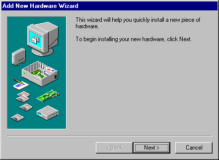
On the first page of a wizard, include a graphic in the left side of the window, as shown in Figure 12.16. The purpose of this graphic is to establish a reference point, or theme such as a conceptual rendering, a snapshot of the area of the display that will be affected, or a preview of the result. On the top right portion of the wizard window, provide a short paragraph that welcomes the user to the wizard and explains what it does. You may also include controls for entering or editing input to be used by the wizard, if there is sufficient space. However, avoid offering too many choices or choices that may be difficult to distinguish or understand without context.
Figure 12.16 An introductory page of a wizard
On subsequent pages you can continue to include a graphic for consistency or, if space is critical, use the entire width of the window for displaying instructional text and controls for user input. When using graphics, include pictures that help illustrate the process, as shown in Figure 12.17. Include default values or settings for all controls where possible.
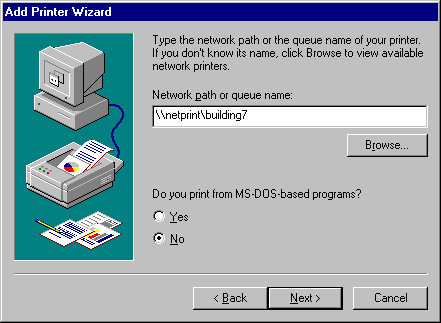
Figure 12.17 Input page for a wizard
You can include the Finish button at any point that the wizard can complete the task. For example, if you can provide reasonable defaults, you can even include the Finish button on the first page. Place the Finish button to the right and adjacent to the Next button. This allows the user to step through the entire wizard or only the page on which they wish to provide input. Otherwise, if the user needs to step through each page of the wizard, replace the Next button with the Finish button on the last page of the wizard. Also on the last page of the wizard, indicate to the user that the wizard is prepared to complete the task and instruct the user to click the Finish button.
Design your wizard pages to be easy to understand. It is important that users immediately understand what a wizard is about so they don't feel like they have to read it very carefully to understand what they have to answer. It is better to have a greater number of simple pages with fewer choices than a smaller number of complex pages with too many options or text. In addition, follow the conventions outlined in this guide and consider the following guidelines when designing a wizard: