Fonts have many functions in addition to providing letterforms for reading. Like other visual elements, fonts organize information or create a particular mood. By varying the size and weight of a font, we see text as more or less important and perceive the order in which it should be read.
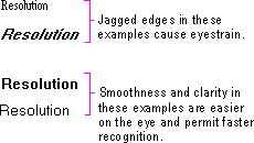
At conventional resolutions of computer displays, fonts are generally less legible online than on a printed page. Avoid italic and serif fonts; these are often hard to read, especially at low resolutions. Figure 13.1 shows various font choices.
Figure 13.1 Effective and ineffective font choices
Limit the number of fonts and styles you use in your software's interface. Using too many fonts usually results in visual clutter.
Wherever possible, use the standard system font for common interface elements. This provides visual consistency between your interface and the system's interface and also makes your interface more easily scaleable. Because many interface elements can be customized by the user, check the system settings for the default system font and set the fonts in your interface accordingly. For more information about system font settings, see "Layout" later in this chapter.