
For more information about standard control behavior and appearance, see Chapter 7, "Menus, Controls, and Toolbars," and the documentation included in the Win32 SDK.
The visual design of controls includes the various states supported by the control. If you use standard Windows controls, Windows automatically provides specific appearances for these states. If you design your own controls, use the information in the previous section for the appropriate border style and information in the following sections to make your controls consistent with standard Windows controls.
Note
For more information about standard control behavior and appearance, see Chapter 7, "Menus, Controls, and Toolbars," and the documentation included in the Win32 SDK.
When the user presses a control, it provides visual feedback on the down transition of the mouse button. (For the pen, the feedback provided is for when the pen touches the input surface and for the keyboard, upon the down transition of the key.)
For standard Windows check boxes and option buttons, the background of the button field is drawn using the button face color, as shown in
Figure 13.9.
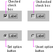
Figure 13.9 Pressed appearance for check boxes and option buttons
For command buttons, the button-down border style is used and the button label moves down and to the right by one pixel, as shown in Figure 13.10.
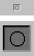
Figure 13.10 Pressed appearance for a command button
When using buttons to indicate when its associated value or state applies or is currently set, the controls provide an option-set appearance. The option-set appearance is used upon the up transition of the mouse button or pen tip, and the down transition of a key. It is visually distinct from the pressed appearance.
Standard check boxes and option buttons provide a special visual indicator when the option corresponding to that control is set. A check box uses a check mark, and an option button uses a dot that appears inside the button, as shown in Figure 13.11.
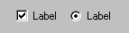
Figure 13.11 Option-set appearance for check boxes and option buttons
When using command buttons to represent properties or other state information, the button face reflects when the option is set. The button continues to use the button-down border style, but a checkerboard pattern (dither) using the color of the button face and button highlight is displayed on the interior background of the button, as shown in Figure 13.12. For configurations that support 256 or more colors, if the button highlight color setting is not white, the button interior background is drawn in a halftone between button highlight color and button face color. The glyph on the button does not otherwise change from the pressed appearance.
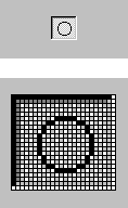
Figure 13.12 Option-set appearance for a command button
For well controls (shown in Figure 13.13), when a particular choice is set, place a border around the control, using the window text color and the button highlight color.
Figure 13.13 Option-set appearance for a well
When a control represents a property or other setting that reflects a set of objects where the values are different, the control is displayed with a mixed-value appearance (also referred to as indeterminate appearance), as shown in Figure 13.14.
For most standard controls, leave the field with no indication of a current set value if it represents a mixed value. For example, for a drop-down list, the field is blank.
Standard check boxes support a special appearance for this state that displays the check mark, in the button shadow color, against a checkerboard background that uses the button highlight color and button face color. For configurations that support 256 or more colors, if the button highlight color setting is not white, the interior of the control is drawn in a halftone between button highlight color and button face color.
Note
The system defines the mixed-value states for check boxes as constants BS_3STATE and BS_AUTO3STATE when using the CreateWindow and CreateWindowEx functions. For more information about these functions, see the documentation included in the Win32 SDK.
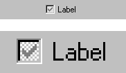
Figure 13.14 Mixed-value appearance for a check box
For graphical command buttons, such as those used on toolbars, the checkerboard pattern, using the button highlight color and button face color, or the halftone color, is drawn on the background of the button face, as shown in Figure 13.15. The image is converted to a monochrome presentation and drawn in the button shadow color.
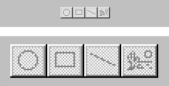
Figure 13.15 Mixed-value appearance for buttons
For check box and command button controls displaying mixed-value appearance, when the user clicks the button, the property value or state is set. Clicking a second time clears the value. As an option, you can support a third click to return the button to the mixed-value state.
When a control is unavailable (also referred to as disabled), its normal functionality is no longer available to the user (though it can still support access to contextual Help information) because the functionality represented does not apply or is inappropriate under the current circumstances. To reflect this state, the label of the control is rendered with a special unavailable appearance, as shown in Figure 13.16.
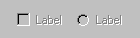
Figure 13.16 Unavailable appearance for check boxes and option buttons
For graphical or text buttons, create the engraved effect by converting the label to monochrome and drawing it in the button highlight color. Then overlay it, at a small offset, with the label drawn in the button shadow color, as shown in Figure 13.17.
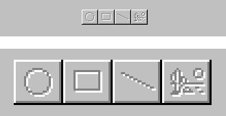
Figure 13.17 Unavailable appearance for buttons
If a check box or option button is set, but the control is unavailable, then the control's label is displayed with an unavailable appearance, and its mark appears in the button shadow color, as shown in Figure 13.18.
Figure 13.18 Unavailable appearance for check boxes and option buttons (when set)
If a graphical button needs to reflect both the set and unavailable appearance (as shown in Figure 13.19), omit the background checkerboard pattern and combine the option-set and the unavailable appearance for the button's label.
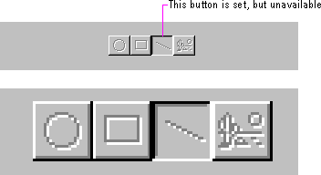
Figure 13.19 Unavailable and option-set appearance for buttons
You can provide a visual indication so the user knows where the input focus is. For text boxes, the system provides a blinking cursor, or insertion point. For other controls a dotted outline is drawn around the control or the control's label, as shown in Figure 13.20.
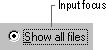
Figure 13.20 Example of input focus in a control
The system provides the input focus appearance for standard controls. To use it with your own custom controls, specify the rectangle to allow at least one pixel of space around the extent of the control. If the input focus indicator would be too intrusive, as an option, you can include it around the label for the control. Display the input focus when the mouse button (pen tip) is pressed while over a control; for the keyboard, display the input focus when a navigation or access key for the control is pressed.
Note
The system provides support for drawing the dotted outline input focus indicator using the DrawFocusRect function. For more information about this function, see the documentation included in the Win32 SDK.
When you nest controls inside of a scrollable region or control, avoid using a three-dimensional appearance because it may not work effectively against the background. Instead, use the flat appearance style, as shown in Figure 13.21.
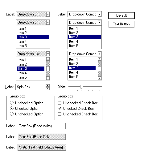
Figure 13.21 Flat appearance for standard controls
The system provides support for the flat appearance style for standard controls. It also includes support for drawing the edges of your own custom controls so you can match the appearance used by standard system controls.
Note
The DrawFrameControl and DrawEdge functions support drawing the flat appearance. For more information about these functions, see the documentation included in the Win32 SDK.