Set up the lesson:
This simple scene contains a World War II airplane to which a standard material with a bitmap in the diffuse channel is applied.
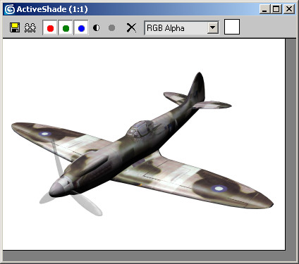
This opens a floating window that re-renders the scene whenever you change a parameter.
Note that the background color is set to white; this makes it easier to see the ink effects.
The first sample sphere shows the Standard material applied to the plane. You'll create an Ink 'n Paint material, then apply it to the fighter plane.
The Material/Map Browser window opens.
The browser closes, and the second slot now contains an Ink 'n Paint material.

After a brief pause, the ActiveShade window re-renders the plane with the Ink 'n Paint material, giving it a much flatter look. Instead of black shadow, the bottom portion of the plane's fuselage is now colored with a darker shade of the blue paint color. Reapply the original material, observe the differences, then apply the Ink 'n Paint material again.
With the default settings, the Ink 'n Paint look is a bit drab. You'll explore some of the alternatives, using first the paint controls then the ink controls.
Modify the paint controls:
The Paint Controls rollout contains three basic settings: Lighted, Shaded, and Highlight. You'll look at each of these briefly, in turn.
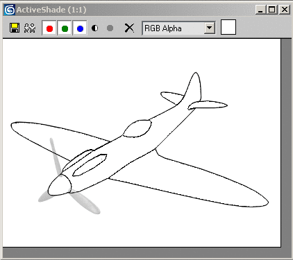
This removes all traces of paint from the object surface as rendered in the ActiveShade window, although the inked outlines remain. It doesn't affect the paint highlight, although that's not on right now so you cannot see it anyway.

The plane now shows three levels of shading, with a new level between the two original levels.
By default, the Ink 'n Paint material uses two levels of shading to match the shading often found in color comics. However, you can increase this up to 255 for a more three-dimensional look, or to as low as 1 for a completely flat look.
As you increase the number of levels, the area of pure paint color becomes smaller, while the darkest shaded area remains the same size.
Next, you'll look at the Shaded setting.

Left: Shaded=35; Right: Shaded=0
As you lower the Shaded value, the shaded areas of the surface get progressively darker, but the lit portion does not. Among other things, this lets you change the apparent lighting setup without touching the light source(s).
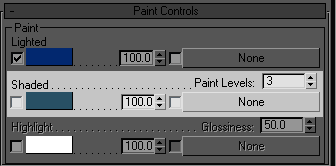
The spinner changes to a color swatch, currently showing a dark blue-green color. The shaded areas now blend between the Lighted color and the Shaded color.

After a brief pause, the ActiveShade window displays the change.
Next, you'll look at the Highlight setting.
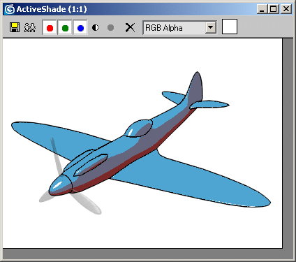
Bright, hard-edged highlights appear in the same places as the specular highlights in the original material.
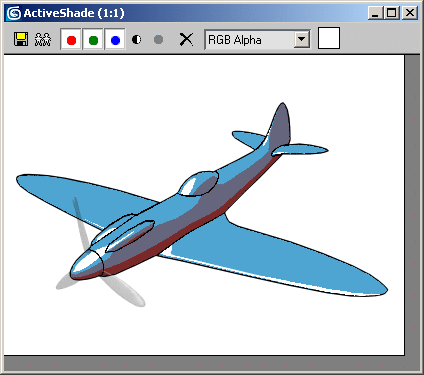
This works just like the Glossiness setting in the Blinn shader: Reducing it enlarges the highlight, while increasing it makes the highlight smaller.
Modify the ink controls:
This lets you start over so you can isolate the ink settings.
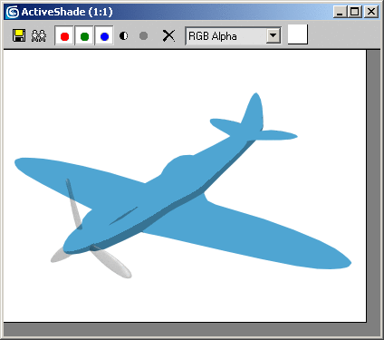
Now only the painted surface is visible. As you can see, the ink effect is very important for the comics look. In most cases, you'll want to keep Ink turned on when using this material.
A slight difference is visible. You'll increase the maximum width to make it more apparent.
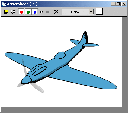
Now it's easier to see that the ink is thinnest where the light intensity is high, and thickest in the most deeply shaded areas. This replicates the look of drawn comics, where the artists ink the outlines of shadowed areas the thickest.
To conclude this lesson, you'll look at some of the available ink types.

The outline vanishes, but the inner line of ink remains. The software creates outline ink only where the object's edges meet the background.

Now the lines acting like borders between faces assigned to different smoothing groups disappear.
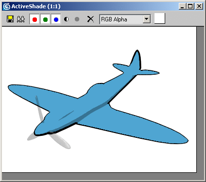
Now the inner line of ink is gone. Overlap ink is generated on the near surfaces when parts of an object's geometry overlap other parts.
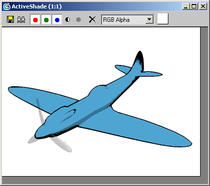
The inner line of ink appears to have thickened. Try toggling Underlap a few times. If you look closely, you'll see the thickness is added above the Overlap line. That's because Underlap ink is generated on the far surfaces adjacent to overlapping geometry (from the current viewpoint). Try turning off Overlap to see the difference.
Working with Maps
Lastly, you'll look at how you can use a map to give the rendering the look of a pencil/charcoal drawing.
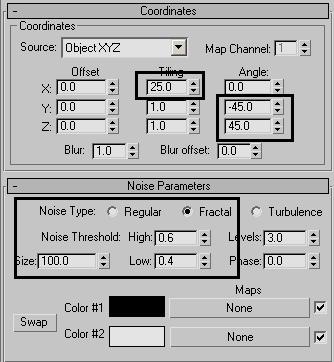
The paint now has a pencil stroke pattern applied to the shaded areas.
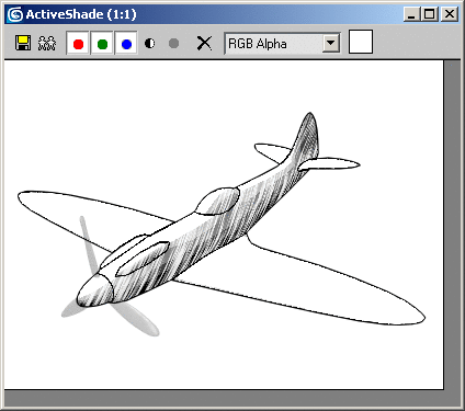
The effect can be strengthened by playing with the light sources in the scene.
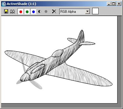
You've scratched the surface of the Ink 'n Paint material with this lesson, but there's much more to it than described here. For instance, you can use any 3ds Max map to specify almost any material component, and you can set each map's intensity to any percent between 0 and 100. You can use ink to outline smoothing groups as seen on the fighter plane in this exercise, but also on areas with different material IDs, and set different colors for each ink type. All of these settings let you achieve a wide range of effects with Ink 'n Paint.