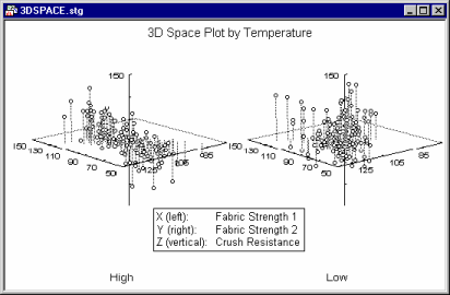
This type of Graphs menu graph (3D Categorized Plots) allows you to categorize 3D scatterplots (and trace plots), contour plots, and surface plots by the specified categories of a selected variable or other logical categorizations of observations.

The information provided in this graph is the same as that shown in the non-categorized 3D scatterplot, surface plot, or contour plot, except that one graph is shown for each group or category specified by the user. Thus, the general purpose of this plot is to facilitate comparisons between groups or categories regarding the relationships between three or more variables
Applications
Applications for the different available 3D graph types are described in the context the of non-categorized graphs. In general, 3D XYZ graphs summarize the interactive relationships between three variables. The different ways in which data can be categorized allow you to review those relationships contingent on some other criterion (e.g., group membership).
For example, a positive relationship between age, health status, and life satisfaction may hold for females in a study, but not for the male participants.

Because categories can be created via logical conditions that specify multiple subsets, you could produce further exploratory graphs to break down the male sample into those who are single and those who are married; you could also create one additional category for high-income males alone, etc.
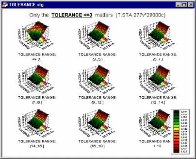
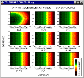
From the categorized surface plot shown below (and its contour plot equivalent), you can conclude that the setting of the tolerance level in an apparatus does not affect the investigated relationship between the measurements (Depend1, Depend2, and Height) unless the setting is <= 3.

Contour plots are sometimes easier to analyze than their surface plot equivalents (as illustrated in the following example).

Thus, the facilities available via the 3D Categorized Plots option provide powerful exploratory tools for studying complex relationships between variables and groups of observations.