In general, two-dimensional scatterplots are used to visualize relations between two variables X and Y (e.g., weight and height). In scatterplots, individual data points are represented by point markers in two-dimensional space, where axes represent the variables. The two coordinates (X and Y) that determine the location of each point correspond to its specific values on the two variables. If the two variables are strongly related, then the data points form a systematic shape (e.g., a straight line or a clear curve). If the variables are not related, then the points form a round "cloud."
The categorized scatterplot option allows you to produce scatterplots categorized by one or two variables. Via the Multiple Subsets options, you can also categorize the scatterplot based on logical selection conditions that define each category or group of observations.
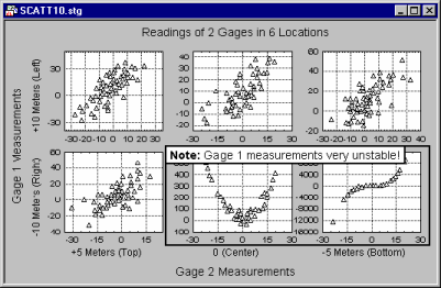
Categorized scatterplots offer a powerful exploratory and analytic technique for investigating relationships between two or more variables within different sub-groups.
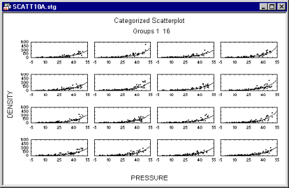
A variety of analytic options are available to enhance exploratory analyses.
Homogeneity of Bivariate Distributions (Shapes of Relations between Variables)
Scatterplots are typically used to identify the nature of relations between two variables (e.g., blood pressure and cholesterol level), because they can provide much more information than a correlation coefficient.
For example, a lack of homogeneity in the sample from which a correlation was calculated can bias the value of the correlation. Imagine a case where a correlation coefficient is calculated from data points that came from two different experimental groups, but this fact was ignored when the correlation was calculated. Suppose the experimental manipulation in one of the groups increased the values of both correlated variables, and thus the data from each group form a distinctive "cloud" in the scatterplot (as shown in the following illustration).
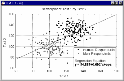
In this example, the high correlation is entirely due to the arrangement of the two groups, and it does not represent the "true" relation between the two variables, which is practically equal to 0 (as could be seen if you looked at each group separately).
If you suspect that such a pattern may exist in your data and you know how to identify the possible "subsets" of data, then producing a categorized scatterplot
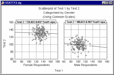
may yield a more accurate picture of the strength of the relationship between the X and Y variable, within each group (i.e., after controlling for group membership).
Fitting Functions to All Subsets Combined or Separately to Each Subset
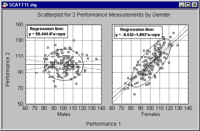
Categorized graphs fit separate functions to each subset of points (one function curve is drawn for each subset, as shown in the following example of an overlaid categorized scatterplot where three regression lines are plotted, one for each subset).
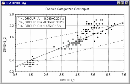
If it is desired to fit one function to all points combined (but you still need to be able to identify the members of each subset), use the Mark Selected Subsets option accessible from the 2D Scatterplots dialog.
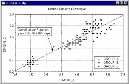
The two graphs shown above were produced from the same dataset.
Curvilinear Relations
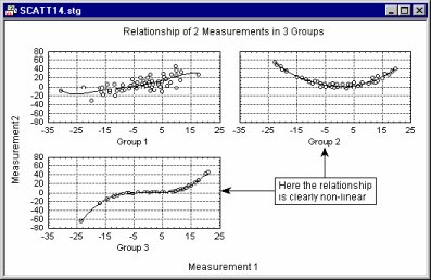
Curvilinearity is another aspect of the relationships between variables that can be examined in scatterplots. There are no "automatic" or easy-to-use tests to measure curvilinear relationships between variables: The standard Pearson r coefficient measures only linear relations; some nonparametric correlations such as the Spearman R can measure curvilinear relations, but not non-monotonous relations. Examining scatterplots allows you to identify the shape of relations, so that later an appropriate data transformation can be chosen to "straighten" the data or choose an appropriate nonlinear estimation equation to be fit.
For more information, refer to Basic Statistics, Distribution Fitting, Multiple Regression, and Nonlinear Estimation.