
Contents
Previous Topic: TCITEMHEADER
Next Topic: Toolbar Control Reference
| | |
| ||
| ||
Toolbar Controls
A toolbar is a control window that contains one or more buttons. Each button sends a command message to the parent window when the user clicks it.
Toolbar Control Updates in Internet Explorer
About Toolbar Controls
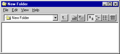
Typically, the buttons in a toolbar correspond to items in the application's menu, providing an additional and more direct way for the user to access an application's commands. The following illustration shows a window that has a toolbar positioned below the menu bar.
A toolbar has built-in customization features—including a system-defined customization dialog box—that allow the user to insert, delete, or rearrange toolbar buttons. An application determines whether the customization features are available to the user and controls the extent to which the user may customize the toolbar.
Toolbar Creation
You can use the CreateToolbarEx function to create a toolbar and add an initial set of buttons to it. You can also use the CreateWindowEx function, specifying the TOOLBARCLASSNAME window class, but this second method creates a toolbar that initially contains no buttons. You add buttons to the toolbar by using the TB_ADDBUTTONS or TB_INSERTBUTTON message. If you will be retrieving the size of the toolbar, you must send the TB_AUTOSIZE message after all of the items and strings have been inserted into the control to cause the toolbar to recalculate its size based on its content.
The TOOLBARCLASSNAME window class is registered when the common control dynamic-link library (DLL) is loaded. To ensure that this DLL is loaded, use the InitCommonControls function first.
A toolbar must be created as a child window with the WS_CHILD style. If you use CreateWindowEx to create a toolbar, you must specify the WS_CHILD window style. CreateToolbarEx includes the WS_CHILD style by default. You must specify the initial parent window when creating the toolbar, but you can change the parent window after creation by using the TB_SETPARENT message.
Toolbar Size and Position
The window procedure for a toolbar automatically sets the size and position of the toolbar window. The height is based on the height of the buttons in the toolbar. The width is the same as the width of the parent window's client area. The CCS_TOP and CCS_BOTTOM common control styles determine whether the toolbar is positioned along the top or bottom of the client area. By default, a toolbar has the CCS_TOP style.
The toolbar window procedure automatically adjusts the size of the toolbar whenever it receives a WM_SIZE or TB_AUTOSIZE message. An application should send either of these messages whenever the size of the parent window changes or after sending a message that requires the size of the toolbar to be adjusted—for example, the TB_SETBUTTONSIZE message.
Tooltip Style
There is only one class-specific style associated with toolbars: TBSTYLE_TOOLTIPS. When you specify this style, the toolbar creates and manages a tooltip control. A tooltip control is a small pop-up window that contains a line of text describing a toolbar button. The tooltip control is hidden and appears only when the user moves the cursor over a toolbar button and leaves it there for approximately one second. The tooltip control is displayed near the cursor.
When the toolbar receives a WM_MOUSEMOVE message, it sends a notification message to the tooltip control. The tooltip control sets a timer and, after approximately one second, checks to see if the cursor is still at the same location and is on a toolbar button. If it is, the tooltip control sends the TTN_NEEDTEXT notification message to the parent window to retrieve the descriptive text for the button. Then the tooltip control creates a pop-up window and displays the text in the window. The tooltip control destroys the pop-up window when the user clicks a mouse button or moves the cursor out of the toolbar.
An application that needs to send messages directly to the tooltip control can retrieve the handle to the tooltip by using the TB_GETTOOLTIPS message. An application can replace the tooltip control of a toolbar with another tooltip control by using the TB_SETTOOLTIPS message.
Toolbar Bitmaps
Each button in a toolbar can include a bitmapped image. A toolbar stores the information that it needs to draw the images in an internal list. When you call the CreateToolbarEx function, you specify a monochrome or color bitmap that contains the initial images, and the toolbar adds the information to the internal list of images. You can add additional images later by using the TB_ADDBITMAP message.
Each image has a zero-based index. The first image added to the internal list has an index of zero, the second image has an index of one, and so on. TB_ADDBITMAP adds images to the end of the list and returns the index of the first new image that it added. You use an image's index to associate the image with a button.
Microsoft® Windows assumes that all of a toolbar's bitmapped images are the same size. You specify the size when you create the toolbar by using CreateToolbarEx. If you use the CreateWindowEx function to create a toolbar, the size of the images is set to the default dimensions of 16 by 15 pixels. You can use the TB_SETBITMAPSIZE message to change the dimensions of the bitmapped images, but you must do so before adding any images to the internal list of images.
Toolbar Strings
Each button can display a string in addition to, or instead of, an image. A toolbar maintains an internal list that contains all of the strings available to toolbar buttons. You add strings to the internal list by using the TB_ADDSTRING message, specifying the address of the buffer containing the strings to add. Each string must be null-terminated, and the last string must be terminated with two null characters.
Each string has a zero-based index. The first string added to the internal list of strings has an index of zero, the second string has an index of one, and so on. TB_ADDSTRING adds strings to the end of the list and returns the index of the first new string. You use a string's index to associate the string with a button.
Toolbar Buttons
You add buttons to a toolbar by filling an array of TBBUTTON structures and specifying the address of the array either in the TB_ADDBUTTONS message or in a call to the CreateToolbarEx function. You can also use the TB_INSERTBUTTON message, which passes the address of a TBBUTTON structure to the toolbar. Each TBBUTTON structure defines the attributes of a button, including the indexes of its string and bitmap as well as its style, state, command identifier, and application-defined 32-bit value.
If you use the CreateWindowEx function to create a toolbar, you must send the TB_BUTTONSTRUCTSIZE message before adding any buttons. The message passes the size of the TBBUTTON structure to the toolbar.
Toolbar button styles
A button's style determines how the button appears and how it responds to user input. The TBSTYLE_BUTTON style creates a toolbar button that behaves like a standard push button. A button that has the TBSTYLE_CHECK style is similar to a standard push button, except it toggles between the pressed and nonpressed states each time the user clicks it.
You can create groups of toolbar buttons that act like radio buttons by using the TBSTYLE_GROUP or TBSTYLE_CHECKGROUP style. This causes a button to stay pressed until the user chooses another button in the group. The TBSTYLE_SEP style creates a small gap between buttons. A button with this style does not receive user input.
Toolbar button states
Each button in a toolbar has a current state. The toolbar updates a button's state to reflect user actions, such as clicking the button. The state indicates whether the button is currently pressed or not pressed, enabled or disabled, hidden or visible, and so on. Although an application sets a button's initial state when adding the button to the toolbar, it can change and retrieve the state by sending messages to the toolbar. For a list of toolbar button states, see Toolbar States.
An application can use the TB_GETSTATE and TB_SETSTATE messages to retrieve and set the state of a button. In addition, a toolbar includes the following messages that retrieve or set a particular state:
TB_CHECKBUTTON TB_ISBUTTONCHECKED TB_ENABLEBUTTON TB_ISBUTTONENABLED TB_HIDEBUTTON TB_ISBUTTONHIDDEN TB_INDETERMINATE TB_ISBUTTONINDETERMINATE TB_PRESSBUTTON TB_ISBUTTONPRESSED Command identifier
Each button has a command identifier associated with it. When the user selects a button, the toolbar sends the parent window a WM_COMMAND message that includes the command identifier of the button. The parent window examines the command identifier and carries out the command associated with the button.
Button size and position
A toolbar keeps track of its buttons by assigning each button a position index. The index is zero-based; that is, the leftmost button has an index of zero, the next button to the right has an index of one, and so on. An application must specify the index of a button when sending messages to retrieve information about the button or to set the button's attributes.
A toolbar updates the position indexes as buttons are inserted and removed. An application can retrieve the current position index of a button by using the TB_COMMANDTOINDEX message. The message specifies the command identifier of a button, and the toolbar window uses the identifier to locate the button and return its position index.
All buttons in a toolbar are the same size. The CreateToolbarEx function requires you to set the initial size of the buttons when you create the toolbar. When you use the CreateWindowEx function to create a toolbar, the initial size is set to the default dimensions of 24 by 22 pixels. You can use the TB_SETBUTTONSIZE message to change the button size, but you must do so before adding any buttons to the toolbar. The TB_GETITEMRECT message retrieves the current dimensions of the buttons.
When you add a string that is longer than any string currently in the toolbar, the toolbar automatically resets the width of its buttons. The width is set to accommodate the longest string in the toolbar.
Customization
A toolbar has built in customization features that you can make available to the user by giving the toolbar the CCS_ADJUSTABLE common control style. The customization features allow the user to drag a button to a new position or to remove a button by dragging it off the toolbar. In addition, the user can double-click the toolbar to display the Customize Toolbar dialog box, which allows the user to add, delete, and rearrange toolbar buttons. An application can display the dialog box by using the TB_CUSTOMIZE message.
The toolbar sends notification messages (in the form of WM_NOTIFY messages) to the parent window at each step in the customization process. If the user holds the SHIFT key down and begins dragging a button, the toolbar automatically handles the drag operation. The toolbar sends the TBN_QUERYDELETE notification message to the parent window to determine whether the button may be deleted. The drag operation ends if the parent window returns FALSE. Otherwise, the toolbar captures mouse input and waits for the user to release the mouse button.
When the user releases the mouse button, the toolbar determines the location of the mouse cursor. If the cursor is outside the toolbar, the button is deleted. If the cursor is on another toolbar button, the toolbar sends the TBN_QUERYINSERT notification message to the parent window to determine if a button may be inserted to the left of the given button. The button is inserted if the parent window returns TRUE. The toolbar sends the TBN_TOOLBARCHANGE notification message to signal the end of the drag operation.
If the user begins a drag operation without holding down the SHIFT key, the toolbar sends the TBN_BEGINDRAG notification message to the parent window. An application that implements its own button-dragging code can use this message as a signal that a drag operation has begun. The toolbar sends the TBN_ENDDRAG notification message to signal the end of the drag operation.
A toolbar sends notification messages when the user customizes a toolbar by using the Customize Toolbar dialog box. The toolbar sends the TBN_BEGINADJUST notification message after the user double-clicks the toolbar, but before the dialog box is created. Next, the toolbar begins sending a series of TBN_QUERYINSERT notification messages to determine whether the toolbar allows buttons to be inserted. When the parent window returns TRUE, the toolbar stops sending TBN_QUERYINSERT notifications. If the parent window does not return TRUE for any button, the toolbar destroys the dialog box.
Next, the toolbar determines if any buttons may be deleted by sending one TBN_QUERYDELETE notification message for each button in the toolbar. The parent window returns TRUE to indicate that a button may be deleted; otherwise, it returns FALSE. The toolbar adds all toolbar buttons to the dialog box, but it grays those that may not be deleted.
When the toolbar needs information about a button in the Customize Toolbar dialog box, it sends the TBN_GETBUTTONINFO notification message, specifying the index of the button for which it needs information and the address of an NMTOOLBAR structure. The parent window must fill the structure with the relevant information.
The Customize Toolbar dialog box includes a Help button and a Reset button. When the user chooses the Help button, the toolbar sends the TBN_CUSTHELP notification message. The parent window should respond by displaying Help information. The dialog box sends the TBN_RESET notification message when the user selects the Reset button. This message signals that the toolbar is about to reinitialize the dialog box.
An application can use the TB_SAVERESTORE message to save the current state of a toolbar in an initialization file or to restore the state based on information previously stored in an initialization file. The message saves the state information in the specified initialization file or in the Win.ini file if no initialization file is specified. An application typically stores the state before the user begins customizing the toolbar in case the user later wants to restore the toolbar to its original state.
Default Message Handling
This section describes the window message processing performed by a toolbar. Messages specific to toolbars are discussed in other sections of this documentation, so they are not included here.
Message Default processing WM_CHARTOITEM Forwards this message to the parent window. WM_COMMAND Forwards this message to the parent window. WM_CREATE Allocates internal memory and graphics objects. It also initializes internal variables and data structures. WM_DESTROY Frees all memory and graphics objects previously allocated for the toolbar. WM_DRAWITEM Forwards this message to the parent window. WM_LBUTTONDBLCLK Forwards this message to the DefWindowProc function and returns the result. WM_LBUTTONDOWN Forwards this message to the tooltip control. If a button was clicked, it sets the state of the button and redraws it. It begins a drag operation if the toolbar has the CCS_ADJUSTABLE style and the SHIFT key is down (or the ALT key, if the toolbar has the TBSTYLE_ALTDRAG style). WM_LBUTTONUP Forwards this message to the tooltip control. If a button was clicked, it sets the state of the button and redraws it. It also ends the drag operation, if one is underway, and redraws the toolbar. WM_MEASUREITEM Forwards this message to the parent window. WM_MOUSEMOVE Forwards this message to the tooltip control. If a button has the mouse capture and the cursor moves out of the button rectangle, it redraws the button. It checks whether the toolbar has lost the mouse capture and, if it has, ends the drag operation. WM_NCACTIVATE, WM_NCPAINT Redraws the borders of the toolbar if the toolbar does not have the CCS_NODIVIDER style. Otherwise, it forwards the message to the DefWindowProc function. WM_NOTIFY Forwards the TTN_NEEDTEXT notification message from the tooltip control to the parent of the toolbar. WM_PAINT Draws the toolbar. If the wParam parameter is non-NULL, the control assumes that the value is an HDC and paints using that device context. WM_SIZE Recalculates the size and position of the toolbar and redraws it. WM_SYSCOLORCHANGE Updates the colors of the buttons and toolbar to match the system colors. WM_VKEYTOITEM Forwards this message to the parent window. WM_WININICHANGE Reinitializes internal variables that depend on system metric values. Using Toolbar Controls
This section contains examples that demonstrate how to create a toolbar and process tooltip notification messages.
Creating a Toolbar
The following example shows how to use the CreateWindowEx function to create a toolbar that the user can customize and that has a tooltip control associated with it. The example uses the TB_ADDBITMAP and TB_ADDSTRING messages to add button images and buttons strings to the toolbar. The example also adds three buttons by using the TB_ADDBUTTONS message.
	// CreateAToolBar - creates a toolbar and adds the initial set of
	//     buttons to it.
	// Returns the handle to the toolbar if successful, or NULL otherwise.
	// hwndParent - handle to the parent window.
	HWND CreateAToolBar(HWND hwndParent)
	{
	    HWND hwndTB;
	    TBADDBITMAP tbab;
    TBBUTTON tbb[3];
    char szBuf[16];
    int iCut, iCopy, iPaste;

    // Ensure that the common control DLL is loaded.
    InitCommonControls();

    // Create a toolbar that the user can customize and that has a
    // tooltip associated with it.
    hwndTB = CreateWindowEx(0, TOOLBARCLASSNAME, (LPSTR) NULL,
        WS_CHILD | TBSTYLE_TOOLTIPS | CCS_ADJUSTABLE,
        0, 0, 0, 0, hwndParent, (HMENU) ID_TOOLBAR, g_hinst, NULL);

    // Send the TB_BUTTONSTRUCTSIZE message, which is required for
    // backward compatibility.
    SendMessage(hwndTB, TB_BUTTONSTRUCTSIZE,
        (WPARAM) sizeof(TBBUTTON), 0);

    // Add the bitmap containing button images to the toolbar.
    tbab.hInst = g_hinst;
    tbab.nID   = IDB_BUTTONS;
    SendMessage(hwndTB, TB_ADDBITMAP, (WPARAM) NUM_BUTTON_BITMAPS,
        (WPARAM) &tbab);

    // Add the button strings to the toolbar.
    LoadString(g_hinst, IDS_CUT, (LPSTR) &szBuf, MAX_LEN);
    iCut = SendMessage(hwndTB, TB_ADDSTRING, 0, (LPARAM) (LPSTR) szBuf);

    LoadString(g_hinst, IDS_COPY, (LPSTR) &szBuf, MAX_LEN);
    iCopy = SendMessage(hwndTB, TB_ADDSTRING, (WPARAM) 0,
        (LPARAM) (LPSTR) szBuf);

    LoadString(g_hinst, IDS_PASTE, (LPSTR) &szBuf, MAX_LEN);
    iPaste = SendMessage(hwndTB, TB_ADDSTRING, (WPARAM) 0,
        (LPARAM) (LPSTR) szBuf);

    // Fill the TBBUTTON array with button information, and add the
    // buttons to the toolbar.
    tbb[0].iBitmap = BMP_CUT;
    tbb[0].idCommand = IDM_CUT;
    tbb[0].fsState = TBSTATE_ENABLED;
    tbb[0].fsStyle = TBSTYLE_BUTTON;
    tbb[0].dwData = 0;
    tbb[0].iString = iCut;

    tbb[1].iBitmap = BMP_COPY;
    tbb[1].idCommand = IDM_COPY;
    tbb[1].fsState = TBSTATE_ENABLED;
    tbb[1].fsStyle = TBSTYLE_BUTTON;
    tbb[1].dwData = 0;
    tbb[1].iString = iCopy;

    tbb[2].iBitmap = BMP_PASTE;
    tbb[2].idCommand = IDM_PASTE;
    tbb[2].fsState = TBSTATE_ENABLED;
    tbb[2].fsStyle = TBSTYLE_BUTTON;
    tbb[2].dwData = 0;
    tbb[2].iString = iPaste;

    SendMessage(hwndTB, TB_ADDBUTTONS, (WPARAM) NUM_BUTTONS,
        (LPARAM) (LPTBBUTTON) &tbb);

    SendMessage(hwndTB, TB_AUTOSIZE, 0, 0);

    ShowWindow(hwndTB, SW_SHOW);
    return hwndTB;
	}
Processing Tooltip Notification Messages
A toolbar that has the TBSTYLE_TOOLTIPS style creates a tooltip control, which an application can use to display Help text for toolbar buttons. The parent window receives the TTN_NEEDTEXT notification message when the toolbar needs the Help text for a button. The tooltip sends the notification in the form of a WM_NOTIFY message. The lParam parameter includes the address of a TOOLTIPTEXT structure that specifies the command identifier of the button for which Help text is needed. An application can copy the Help text to the structure, specify the address of a string containing the Help text, or specify the instance handle and resource identifier of a string resource.
The following example demonstrates how to process the TTN_NEEDTEXT notification.
	case WM_NOTIFY:
    switch (((LPNMHDR) lParam)->code) {
        case TTN_NEEDTEXT:
            {
            LPTOOLTIPTEXT lpttt;

            lpttt = (LPTOOLTIPTEXT) lParam;
            lpttt->hinst = g_hinst;

            // Specify the resource identifier of the descriptive
            // text for the given button.
            idButton = lpttt->hdr.idFrom;
            switch (idButton) {
                case IDM_CUT:
                    lpttt->lpszText = MAKEINTRESOURCE(IDS_TIPS_CUT);
                    break;
                case IDM_COPY:
                    lpttt->lpszText = MAKEINTRESOURCE(IDS_TIPS_COPY);
                    break;
                case IDM_PASTE:
                    lpttt->lpszText = MAKEINTRESOURCE(IDS_TIPS_PASTE);
                    break;
            }
            break;
            }
        .
        . // Process other notifications here.
        .
        default:
            break;
    }
Toolbar Control Updates in Internet Explorer
Toolbar controls in Microsoft® Internet Explorer support the following new features.
- Image List Support
- Toolbar controls can use up to three different image lists to display buttons in various states:
Normal Buttons in their default state. Hot Buttons that are under the pointer or pressed. Hot items are only supported in toolbar controls that have the TBSTYLE_FLAT style. Disabled Buttons that are disabled. Applications can still use bitmaps for toolbar buttons. Image list support is offered to allow the control to have greater flexibility. An application sets and retrieves toolbar image lists for normal buttons with the TB_SETIMAGELIST and TB_GETIMAGELIST messages, respectively. Similarly, the TB_SETHOTIMAGELIST, TB_GETHOTIMAGELIST, TB_SETDISABLEDIMAGELIST, and TB_GETDISABLEDIMAGELIST messages perform the same actions for hot and disabled button image lists.
- Transparent Toolbars
- Toolbar controls support a new, transparent look. An application can create a transparent toolbar control by including the TBSTYLE_FLAT style. With the TBSTYLE_FLAT style in place, the control displays buttons while allowing the client area under the toolbar to show through.
Transparent toolbar controls feature hot tracking. That is, when the user moves the pointer over a toolbar button, the button's appearance changes. The control displays a border around the "hot" button and, if a hot image list is set, switches the image under the pointer.
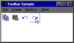
The following illustration shows a transparent toolbar control with four buttons.
For more information on transparent toolbars, see Creating a Transparent Toolbar Control later in this section.
- Drop-Down Toolbar Buttons
- Toolbar controls support drop-down style buttons. Drop-down buttons have the TBSTYLE_DROPDOWN style. When the user clicks a drop-down button, the toolbar control sends its parent a TBN_DROPDOWN notification message. If the parent is going to display a drop-down menu, it can display one using the TrackPopupMenuEx function and return zero to the notification message. For more information, see Supporting Drop-Down Toolbar Buttons later in this section.
- Insertion Marks
- Toolbar controls now support insertion marks. An insertion mark provides a visual indication where an item will be inserted. This is useful for dragging and dropping items into a toolbar. Insertion marks are implemented using the TB_SETINSERTMARK, TB_GETINSERTMARK, and TB_INSERTMARKHITTEST messages.
Creating a Transparent Toolbar Control
To create a transparent toolbar control, use the CreateWindowEx function, specifying TOOLBARCLASSNAME as the window class. You must first register the window class by calling the InitCommonControlsEx function, while specifying the ICC_BAR_CLASSES bit in the accompanying INITCOMMONCONTROLSEX structure.
An application must prepare a toolbar control by sending messages it uses to manage memory and format its display. The CreateTransparentToolbar sample function creates a normal or list style transparent toolbar control. It accepts style bits in the dwStyle parameter that are used to determine which type of toolbar it will create.
To support button text and list style buttons, CreateTransparentToolbar calls the following application-defined functions:
The CreateTransparentToolbar Sample Function
The CreateTransparentToolbar application-defined function creates and initializes a transparent toolbar.
// CreateTransparentToolbar Function
//     Creates a transparent toolbar control based on the owner's
//     window handle and a supplied set of styles that is assumed
//     to be a combination of TBSTYLE_FLAT and TBSTYLE_LIST flags.
//
// Accepts:
//    HWND: The handle to the parent window.
//    DWORD:  Style values that are included in CreateWindowEx.
//
// Returns:
//    HWND to the newly created toolbar. The owner must resize it.

HWND WINAPI CreateTransparentToolbar(HWND hwndOwner, DWORD dwStyle.)
{
   HWND         hwndTB;
   HIMAGELIST   himl, himlHot;
   TBBUTTON     tbArray[MAX_BUTTONS];
   int          i, iListSpace;
   INITCOMMONCONTROLSEX icex;

   LPTSTR lpszStrList,
          pszStrArray[4] = { "Button 1",
                             "Button 2",
                             "Button 3",
                             "Button 4"};

   icex.dwSize = sizeof(INITCOMMONCONTROLSEX);
   icex.dwICC  = ICC_BAR_CLASSES;
   InitCommonControlsEx(&icex);

   // Create the toolbar control.
   hwndTB=CreateWindowEx(WS_EX_TOOLWINDOW,
                         TOOLBARCLASSNAME,
                         NULL,
                         WS_CHILD | WS_VISIBLE | WS_CLIPCHILDREN |
                         WS_CLIPSIBLINGS | CCS_NODIVIDER
                         |CCS_NOPARENTALIGN | CCS_NORESIZE | dwStyle,
                         0,0,0,0,  // Make it zero, Let owner resize it.
                         hwndOwner,
                         NULL, g_hinst, NULL);

   // Sets the size of the TBBUTTON structure.
   SendMessage(hwndTB, TB_BUTTONSTRUCTSIZE, sizeof(TBBUTTON), 0);

   // Set the maximum number of text rows and bitmap size.
   SendMessage(hwndTB, TB_SETMAXTEXTROWS, 1, 0L);
   SendMessage(hwndTB, TB_SETBITMAPSIZE,
               0, (LPARAM)MAKELONG(MYICON_CX, MYICON_CY));

   // Create, fill, and assign the image list for default buttons.
   himl = ImageList_Create(MYICON_CX,MYICON_CY,ILC_COLOR8,0,4);
   ImageList_Add(himl,
                 LoadBitmap(g_hinst,MAKEINTRESOURCE(IDB_DEF1)),NULL);
   ImageList_Add(himl,
                 LoadBitmap(g_hinst, MAKEINTRESOURCE(IDB_DEF2)),NULL);
   ImageList_Add(himl,
                 LoadBitmap(g_hinst, MAKEINTRESOURCE(IDB_DEF3)),NULL);
   ImageList_Add(himl,
                 LoadBitmap(g_hinst, MAKEINTRESOURCE(IDB_DEF4)),NULL);

   SendMessage(hwndTB, TB_SETIMAGELIST, 0, (LPARAM)himl);

   // Create, fill, and assign the image list for hot buttons.
   himlHot = ImageList_Create(MYICON_CX,MYICON_CY,ILC_COLOR8,0,4);
   ImageList_Add(himlHot,
                 LoadBitmap(g_hinst, MAKEINTRESOURCE(IDB_HOT1)),NULL);
   ImageList_Add(himlHot,
                 LoadBitmap(g_hinst, MAKEINTRESOURCE(IDB_HOT2)),NULL);
   ImageList_Add(himlHot,
                 LoadBitmap(g_hinst, MAKEINTRESOURCE(IDB_HOT3)),NULL);
   ImageList_Add(himlHot,
                 LoadBitmap(g_hinst, MAKEINTRESOURCE(IDB_HOT4)),NULL);

   SendMessage(hwndTB, TB_SETHOTIMAGELIST, 0, (LPARAM)himlHot);

   // Loop to fill the array of TBBUTTON structures.
   for(i=0;i<MAX_BUTTONS;i++){
      tbArray[i].iBitmap   = i;
      tbArray[i].idCommand = IDM_BUTTONSTART + i;
      tbArray[i].fsState   = TBSTATE_ENABLED;
      tbArray[i].fsStyle   = TBSTYLE_DROPDOWN;//BUTTON;
      tbArray[i].dwData    = 0;
      tbArray[i].iString   = i;
   }

   // Put button text in the correct format for TB_ADDSTRING.
   lpszStrList = BuildStrList(pszStrArray);

   SendMessage(hwndTB, TB_ADDSTRING, 0,(LPARAM)lpszStrList);

   // If this is a list style toolbar, add buffer pixels
   // to make room for button text.
   iBufferPix=(dwStyle & TBSTYLE_LIST)?WidestBtn(pszStrArray, hwndTB):0;

   // Add the buttons, and then set the minimum and maximum button widths.
   SendMessage(hwndTB,
               TB_ADDBUTTONS, (UINT)MAX_BUTTONS, (LPARAM)tbArray);

   SendMessage(hwndTB,
               TB_SETBUTTONWIDTH, 0,
               (LPARAM)MAKELONG(MYICON_CX+iBufferPix,
               MYICON_CX+iBufferPix));

   return (hwndTB);
}
The BuildStrList Sample Function
The BuildStrList application-defined function creates and fills a buffer based on a static array of strings. The calling function uses the resulting buffer with the TB_ADDSTRING message.
// BuildStrList Function
//    Creates a list of null-terminated strings from a passed-in
//    array of strings. See the documentation about TB_ADDSTRING
//    for specific information about this format.
//
// Accepts:
//    LPTSTR *: Address of the array of strings.
//
// Returns:
//    LPTSTR to the newly created list of button text strings.

LPTSTR WINAPI BuildStrList(LPTSTR * ppszStrArray, INT iStrCount)
{
   LPTSTR pScan,
          pszStrList;

   int i;

   pScan = pszStrList = malloc((size_t)37 * sizeof(char));

   for (i=0;i<iStrCount;i++){
      strcpy(pScan,ppszStrArray[i]);
      pScan += strlen(pScan)+1;
   }
   *pScan = '\0';

   return(pszStrList);
}
The WidestBtn Sample Function
The WidestBtn application-defined function calculates the button width necessary to completely display the widest button text string.
// WidestBtn Function
//     Calculates the width, in pixels, of the widest button in the
//     toolbar. Since toolbar controls use the same width for all
//     buttons, the return value is used when sending the
//     TB_SETBUTTONWIDTH message.
//
// Accepts:
//    LPTSTR *: Address of the array of button text strings.
//    HWND: The handle to the parent window.
//
// Returns:
//    An INT value representing the minimum width, in pixels,
//    a button must be to allow room for the button text.

INT WINAPI WidestBtn(LPTSTR *pszStrArray, HWND hwndOwner)
{
// The toolbar reserves pixels for space between buttons,
// text, and so on. This value is added to the return value
// to compensate.
#define EXTRA_PIXELS 8

   INT      i, iStrMax_cx = 0;
   SIZE     sz;
   LOGFONT  lf;
   HFONT    hFont;
   HDC      hdc;

   // Get the font used to display button text, and then select it into
   // a device context to be passed to GetTextExtentPoint32.
   SystemParametersInfo(SPI_GETICONTITLELOGFONT,sizeof(LOGFONT),&lf,0);

   hdc = GetDC(hwnd);
   hFont = CreateFontIndirect(&lf);
   SelectObject(hdc,hFont);

   // Loop to find the widest string.
   for(i=0;i<MAX_BUTTONS;i++){
      GetTextExtentPoint32(hdc, pszStrArray[i],
                           strlen(pszStrArray[i]), &sz);
      if(sz.cx > iStrMax_cx) iStrMax_cx = sz.cx;
   }

   // Release the DC and font.
   ReleaseDC(hwnd, hdc);
   DeleteObject(hFont);

   // Return the sum of the string width, the border, and extra pixels.
   return (iStrMax_cx + GetSystemMetrics(SM_CXBORDER) + EXTRA_PIXELS);}
Supporting Drop-Down Toolbar Buttons
When the user clicks a toolbar button that uses the TBSTYLE_DROPDOWN style, the toolbar control sends its parent a TBN_DROPDOWN notification message. The following DoNotify application-defined function illustrates how an application can support a drop-down button in a toolbar control by responding to this notification message.
If the incoming notification message is TBN_DROPDOWN, DoNotify retrieves the bounding rectangle of the button the user clicked by sending the TB_GETRECT message. When sending the message, DoNotify specifies the command identifier of the drop-down button as the wParam parameter of the SendMessage function. (The button's command identifier was retrieved from the iItem member of the NMTOOLBAR structure that lParam points to.) After DoNotify retrieves the bounding rectangle, it calls MapWindowPoints to convert the rectangle from client coordinates to screen coordinates. It then retrieves the pop-up menu from a menu resource by using the GetSubMenu function and calls the TrackPopupMenuEx function to display the menu. Note that DoNotify positions the menu under the correct button by using the rectangle it retrieved earlier. It also includes the TPM_VERTICAL flag to ensure that the menu is displayed so that it doesn't overlap the button.
BOOL WINAPI DoNotify(HWND hwnd, UINT msg, WPARAM wParam, LPARAM lParam)
{
#define lpnm   ((LPNMHDR)lParam)
#define lpnmTB ((LPNMTOOLBAR)lParam)

   RECT      rc;
   TPMPARAMS tpm;
   HMENU     hPopupMenu = NULL;
   BOOL      bRet = FALSE;

   switch(lpnm->code){
      case TBN_DROPDOWN:
         SendMessage(lpnmTB->hdr.hwndFrom, TB_GETRECT,
                     (WPARAM)lpnmTB->iItem, (LPARAM)&rc);

         MapWindowPoints(lpnmTB->hdr.hwndFrom,
                         HWND_DESKTOP, (LPPOINT)&rc, 2);

         tpm.cbSize = sizeof(TPMPARAMS);
         tpm.rcExclude.top    = rc.top;
         tpm.rcExclude.left   = rc.left;
         tpm.rcExclude.bottom = rc.bottom;
         tpm.rcExclude.right  = rc.right;

         hPopupMenu =
           GetSubMenu( LoadMenu(g_hinst,MAKEINTRESOURCE(IDR_POPUP)),0);

         TrackPopupMenuEx(hPopupMenu,
                          TPM_LEFTALIGN|TPM_LEFTBUTTON|TPM_VERTICAL,
                          rc.left, rc.bottom, g_hwndMain, &tpm);

         return (FALSE);
   }

   return FALSE;
}
Top of Page
© 1997 Microsoft Corporation. All rights reserved. Terms of Use.