(controlled by LINELENGTH=). The observations are printed in order of person and item measures, with most able persons listed first, the easiest items printed on the left. This scalogram shows the extent to which a Guttman pattern is approximated.
Table
22.2 Guttman scalogram showing out-of-place responses.
22.3 Guttman scalogram showing original responses.
GUTTMAN SCALOGRAM OF RESPONSES: GUTTMAN SCALOGRAM OF ZONED RESPONSES:
PERSON ITEM PUPIL |ACT
1111112 1 221 1 21 22 |111111 2 1221 121 2 2
8920311251427643569784035 |8901231125427634569780435
|-------------------------
41 2222222222222222222222212 41 +22222222222222222222222B2
17 2222222222222222222222210 17 +22222222222222222222222BA
45 2222222222222222222221200 45 +22222222222222222222CC1AA
40 2222222222222122212101100 40 +2222222222222B222121A11AA
65 2222222211011101020101122 65 +222222122BA1111AACA1A11CC
1 2222222221211001011201001 1 +222222122CC11A1AA11CA010B
|-------------------------
1111112211221613219784225 |1111111221221631219782425
8920311 5 427 4 56 03 |890123 1 5427 456 0 3
Interpreting a Scalogram
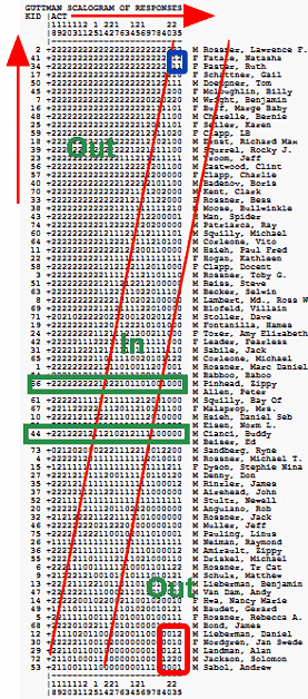
Table 22 for Example0.txt: A scalogram orders the persons from high measure to low measure as rows, and the items from low measure (easy) to high measure (hard) as columns. The green boxes show the probabilistic advance from responses in high categories on the easy items to responses in low categories on the hard items.
Top left corner: where the more able (more liking) children respond to the easier (to like) items. So we expect to see responses of Like (2). We do! Unexpected responses in this area influence the Outfit statistics more strongly.
Top right corner: (blue box) where the most liking children and the hardest to like items meet - you can see some ratings of 1.
Bottom right corner: where less able (less liking) children respond to the harder (to like) items. So we expect to see responses of Dislike (0). But do we?? Something has gone wrong! There are 1s and 2s where we expected all 0s. Unexpected responses in this area influence the Outfit statistics mor strongly.
Diagonal transition zone: Between the red diagonals lies the transition zone where we expect 1s. In this zone Infit is more sensitive to unexpected patterns of responses. More categories in the rating scale means a wider transition zone. Then the transition zone can be wider than the observed responses.
Example: To display Scalogram response strings on the person Tables 6, 17, 18,19.
1. Perform your standard Winsteps analysis.
2. Output Table 22, with a LINELENGTH= big enough for all observations to be on one line.
3. Save Table 22 to your Desktop (or wherever).
4. Open the Table 22 file in software that can do a rectangular copy (NotePad++, TextPad, Word, etc.)
5. Open your Winsteps data file using the same rectangular-copy software.
6. Rectangular copy the Scalogram immediately adjacent to the person labels.
7. Adjust Winsteps control NAMELENGTH= etc for the new data file format.
8. Save the control and data file(s)
9. Perform your revised Winsteps analysis.
10. Table 6 should now display the Scalogram as part of the person label.