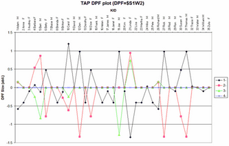
From the Plots menu, DPF Plot 31 produces the plotted output corresponding to Table 31.2. It shows differential person functioning (DPF).
From the Output Tables menu, the DPF dialog is displayed.
In the DPF= box specify the column in the item label that identifies the DPF classification for each person.
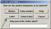
Select what data point labels are to be displayed on the Excel plot. In this case, the person label. The item classifications will be identified by their column codes. You have the full Excel capabilities to edit the plot, and the Excel worksheet contains the plotted numbers. The plotted numbers are contained in the Excel worksheet.
There four Excel plots:
DPF Measure (abil.) "*" indicates the baseline measures (no DPF) , corresponding to the zero line (x-axis) in the DPF Size plot. |
reports the ability of the person for each item classification: DPF "local absolute" Measure = DPF "relative" Size + Overall "baseline" person ability |
DPF Size (abil.) |
reports the size of the person DPF for the item classification relative to the overall "baseline" person ability |
DPF t-value (abil.) |
reports a simple approximate t-test of the person DPF against overall ability. The t-statistic is the statistical probability of the DPF size relative to its measurement error expressed as an approximate unit-normal deviate. A critical values is usually ±2. This tests the hypothesis that the DPF size can be attributed to measurement error. |
DPF Average Score-points |
displays the average difference between the observed response and the expected response for each person on each item CLASS. |
Worksheet |
contains the numbers that are plotted. This can be edited to change the plots. |
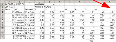
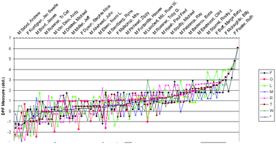
Example: In the Excel worksheet, sort the DPF Measure block, Ascending on overall measure (the * column) |
|
Then look at the DPF measure plot, the persons are ordered by performance on the items, revealing any trends. |
|