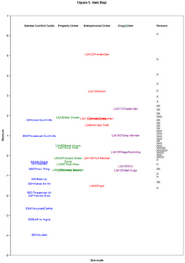
Transferring the item map to a Microsoft Word document: |
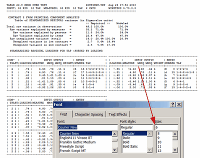
As text: Adjust the size of the map using Winsteps specifications LINELENGTH=, MRANGE=, MAXPAGE= As text: Copy-and-paste the map into the .doc file. In the .doc file, 1. copy-and-paste from Notepad to Word. 2. Select all (ctrl+a) in Word 3. Change font to Courier New 4. If the lines wrap, then 4a. change page orientation to "Landscape" 4b. smaller point size (you can type in point-sizes smaller than on the pull-down list): "6" works well.
|
As a picture: Display the .txt file on your screen. Press your PrintScreen key to copy a picture of the .txt file on your screen into the Windows clipboard. Paste into your Word document. Format the picture. |
As a webpage: Output the item map as a webpage Winsteps specification ASCII=W. Copy-and-paste the item map into your Word document. |
# |
Item Map in Excel |
|
1. |
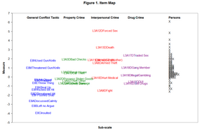
We want to produce this Excel Chart (or close approximation) |
|
2. |
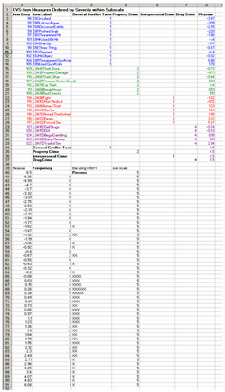
from this Excel worksheet.
Constructed with:
1. x-axis column is the sub-scale number for each item
2 y-axis column is the item measure from IFILE= output to an Excel file.
3 put in headings with x and y coordinates to place at the top or bottom of the columns
4. for the person measure distribution, Use the Scorefile= from the Output File menu. Write the file to Excel, and then use the "Measure" and "Frequency" columns. (If you want different "bins", use PFILE= and the Excel =frequency() formula.)
5. Then use the =REPT() Excel function to format a person sample bar |
|
3. |
On the Excel worksheet toolbar, verify that you have XY Chart Labels. If not, download and install from: http://www.appspro.com/Utilities/ChartLabeler.htm |
|
4. |
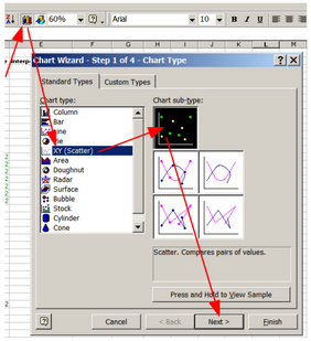
On the Excel Worksheet page, Click on Chart icon Click on XY (Scatter) Click on non-lines sub-type Click on Next |
|
5. |
Click on Series |
|
6. |
Click on Add |
|
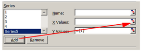
7. |
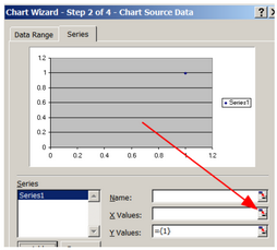
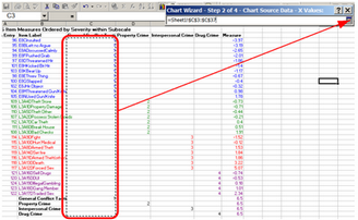
Click on X values |
|
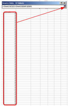
8. |
On Worksheet, drag mouse to highlight first sub-scale column. Then click on series-selector icon |
|
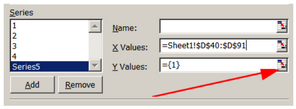
9. |
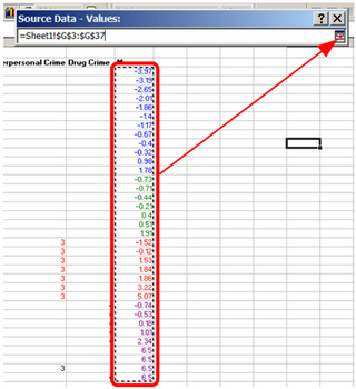
In Chart dialog Click on Y Values selector icon |
|
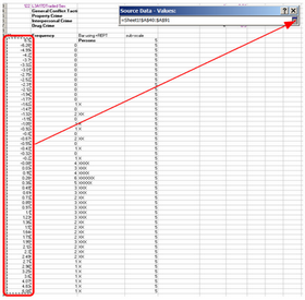
10. |
On Worksheet, drag mouse to highlight measure column. Then click on series-selector icon |
|
11. |
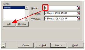
Type in the sub-scale number as the Name For the next subscale: Click Add |
|
12. |
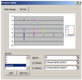
Repeat 7 through 11 for the other item subscales |
|
13. |
Now for the Person distribution Click Add Click on X Values icon |
|
14. |
On worksheet, drag mouse to highlight the person subscale number Click on range-selector icon |
|
15. |
In Chart dialog, click on Y-values icon |
|
16. |
Drag mouse to selecte person measures Click on range-selector icon |
|
17. |
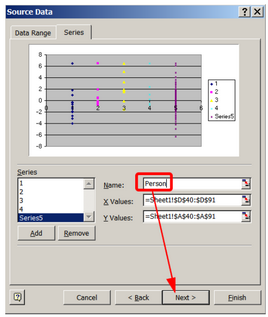
Type int Name: Person Click Next |
|
18. |
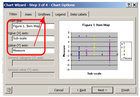
In Chart Wizard: On Titles Tab: Type in Chart Title: Figure 1. Item Map Value (X) axis: Sub-scale Value (Y) axis: Measure Click on Gridlines Tab |
|
19. |
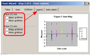
On Gridlines Tab: Uncheck all boxes Click on Legend Tab |
|
20. |
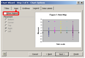
On Legend Tab: Uncheck Show Legend Box Click on Axes Tab |
|
21. |
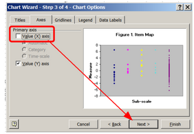
On Axes Tab Uncheck Value (X) axis Click on Next |
|
22. |
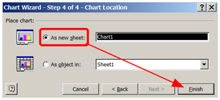
Click on As new sheet Click on Finish |
|
23. |
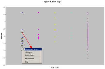
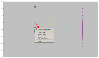
Right-click on first sub-scale Click on Format Data Series |
|
24. |
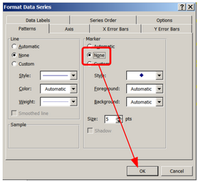
Click on Marker: None Click on OK |
|
25. |
Same again for the other subscales: Right-click on subscale Click on Format Data Series Click on Marker: None Click on OK |
|
26. |
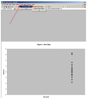
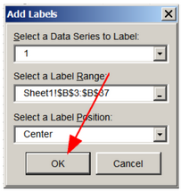
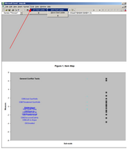
Click on Tools Click on XY Chart Labels Click on Add Chart Labels |
|
27. |
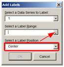
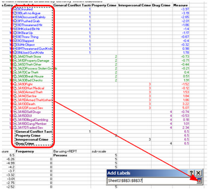
Select Center using pull-down menu Click on Label Range selector |
|
28. |
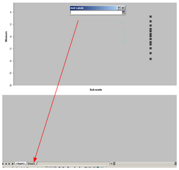
Click on Worksheet Tab |
|
29. |
Drag mouse to select all item names Click on range-selector |
|
30. |
Click on OK |
|
31. |
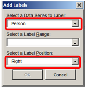
Same again for the other item subscales: Select a Data Series to Label select each item subscale |
|
32. |
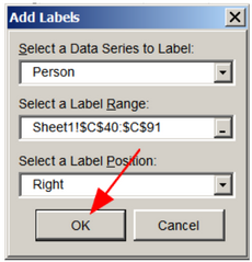
The once more for the Person subscale, but with Label Position: Right |
|
33. |
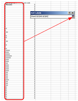
On the Worksheet, Drag the mouse to select the XXXX column Click on the range-selector |
|
34. |
Click on OK |
|
35. |
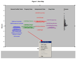
Right-click on plot background Click on Format Plot Area |
|
36. |
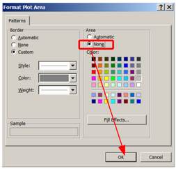
Click on Area: None Click on OK |
|
37. |
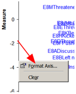
Right-click on the Y-axis Click on Format Axis |
|
38. |
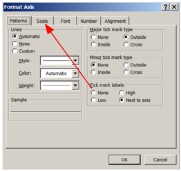
Click on the Scale Tab |
|
39. |
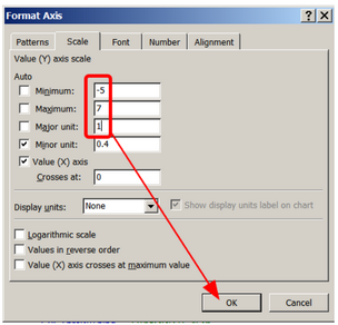
Choose suitable ranges and units, Click OK |
|
40. |
You can now right-click on the labels to change the font size. You can also drag them so they dont overprint |
|
41. |
To copy the plot, click on it to select all of it Copy then Paste Special - Picture into your Word document.
This is what I have done here: |
|
